Chapter 6 On Uncertainty
6.1 Introduction
Fitting a model to a set of data involves searching for parameter estimates that optimize the relationship between the observed data and the predictions of the model. The model parameter estimates are taken to represent properties of the population in which we are interested. While it should be possible to find optimum parameter values in each situation, it remains the case that whatever data is used constitutes only one set of samples from the population. Assuming it were possible to take different, independent, samples of the same kinds of data from the same population, if they were then analysed independently, they would very likely lead to at least slightly different parameter estimates. Thus, the exact value of the estimated parameters is not really the most important issue when fitting a model to data, rather, we want to know how repeatable such estimates are likely to be if we were to have the luxury of multiple independent samples. That is, the parameters are just estimates and we want to know how confident we can be in those estimates. For example, it is common that highly variable data usually leads to each model parameter potentially having a wide distribution of plausible estimates, typically they would be expected to have wide confidence intervals.
In this chapter we will explore alternative ways available for characterizing at least a proportion of the uncertainty inherent in any modelling situation. While there can be many sources of potential uncertainty that can act to hamper our capacity to manage natural resources, only some of these can be usefully investigated here. Some sources of uncertainty influence the variability of data collected, other sources can influence the type of data available.
6.1.1 Types of Uncertainty
There are various ways of describing the different types of uncertainty that can influence parameter estimates from fisheries models and thus, how such estimates can be used. These are often called sources of error, usually in the sense of residual error rather than as a mistake having been made. Unfortunately, the term “error”, as in residual error, has the potential to lead to confusion, so it is best to use the term “uncertainty”. Although as long as you are aware of the issue it should not be a problem for you.
Francis & Shotton (1997) listed six different types of uncertainty relating to natural resource assessment and management, while Kell et al (2005) following Rosenberg and Restrepo (1994), contract these to five. Alternatively, they can all be summarized under four headings (Haddon, 2011), some with sub-headings, as follows:
Process uncertainty: underlying natural random variation in demographic rates (such as growth, inter-annual mean recruitment, inter-annual natural mortality ) and other biological properties and processes.
Observation uncertainty: sampling error and measurement error reflect the fact that samples are meant to represent a population but remain only a sample. Inadequate or non-representative data collection would contribute to observational uncertainty as would any mistakes or the deliberate misreporting or lack of reporting of data, which is not unknown in the world of fisheries statistics.
Model uncertainty: relates to the capacity of the selected model structure to describe the dynamics of the system under study:
- Different structural models may provide different answers and uncertainty exists over which is the better representation of nature.
- The selection of the residual error structure for a given process is a special case of model uncertainty that can have important implications for parameter estimates.
- Estimation uncertainty is an outcome of the model structure having interactions or correlations between parameters such that slightly different parameter sets can lead to identical values of log-likelihood (to the limit of precision used in the numerical model fitting).
- Different structural models may provide different answers and uncertainty exists over which is the better representation of nature.
Implementation uncertainty: where the effects or extent of management actions may differ from those intended. Poorly defined management options may lead to implementation uncertainty.
- Institutional uncertainty: inadequately defined management objectives leading to unworkable management.
- Time-lags between making decisions and implementing them can lead to greater variation. Assessments are often made a year or more after fisheries data is collected and management decisions often take another year or more to be implemented.
- Institutional uncertainty: inadequately defined management objectives leading to unworkable management.
Here we are especially concerned with process, observational, and model uncertainty. Each can influence model parameter estimates and model outcomes and predictions. Implementation uncertainty is more about how the outcomes from a model or models are used when managing natural resources. This can have important effects on the efficiency of different management strategies based on the outcomes of stock assessment models but it does not influence those immediate outcomes (Dichmont et al, 2006).
Model uncertainty can be both quantitative and qualitative. Thus, different models that use exactly the same data and residual structures could be compared to one another and the best fitting selected. Such models may be considered to be related but different. However, where models are incommensurate, for example, when different residual error structures are used with the same structural model, they can each generate an optimum fit and model selection must be based on factors other than just quality of fit. Such models do not grade smoothly into each other but constitute qualitatively and quantitatively different descriptions of the system under study. Model uncertainty is one of the driving forces behind model selection (Burnham and Anderson, 2002). Even where there is only one model developed invariably this has been implicitly selected from many possible models. Working with more than one type of model in a given situation (perhaps a surplus production model along with a fully age-structured model) can often lead to insights that using one model alone would be missed. Sadly, with decreasing resources generally made available for stock assessment modelling, working with more than one model is now an increasingly rare option.
Model and implementation uncertainty are both important in the management of natural resources. We ahve already compared the outcomes from alternative models, however, here we are going to concentrate on methods that allow us to characterize the confidence with which we can accept the various parameter estimates and other model outputs obtained from given models that have significance for management advice.
There are a number of strategies available for characterizing the uncertainty around any parameter estimates or other model outputs. Some methods focus on data issues while other methods focus on the potential distributions of plausible parameter values given the available data. We will consider four different approaches:
bootstrapping, focusses on the uncertainty inherent in the data samples and operates by examining the implications for the parameter estimates had somewhat different samples been taken.
asymptotic errors use a variance-covariance matrix between parameter estimates to describe the uncertainty around those parameter values,
likelihood profiles are constructed on parameters of primary interest to obtain more specific distributions of each parameter, and finally,
Bayesian marginal posteriors characterize the uncertainty inherent in estimates of model parameters and outputs.
Each of these approaches permit the characterization of the uncertainty of both parameters and model outputs and provide for the identification of selected central percentile ranges around each parameter’s mean or expectation (e.g. \(\bar{x}\pm 90\%{CI}\), in some case may not be symmetric).
We will use a simple surplus production model to illustrate all of these methods, although they should be applicable more generally.
6.1.2 The Example Model
This is the same model as described in the section on fitting a dynamic model using log-normal likelihoods in the chapter on Model Parameter Estimation. We will use this in many of the examples in this chapter and it has relatively simple population dynamics, Equ(6.1).
\[\begin{equation} \begin{split} {B_{t=0}} &= {B_{init}} \\ {B_{t+1}} &= {B_t}+r{B_t}\left( 1-\frac{{B_{t}}}{K} \right)-{C_t} \end{split} \tag{6.1} \end{equation}\]
where \(B_t\) represents the available biomass in year \(t\), with \(B_{init}\) being the biomass in the first year of available data (\(t=0\)), taking account of any initial depletion when records begin. \(r\) is the intrinsic rate of natural increase (a population growth rate term), \(K\) is the carrying capacity or unfished available biomass, commonly referred to elsewhere as \(B_0\) (not to be confused with \(B_{init}\)). Finally, \(C_t\) is the total catch taken in year \(t\). To connect these dynamics to observations from the fishery other than the catches we use an index of relative abundance (\(I_t\), often catch-per-unit-effort or cpue, but could be a survey index).
\[\begin{equation} {{I}_{t}}=\frac{{{C}_{t}}}{{{E}_{t}}}=q{{B}_{t}} \;\;\; or \;\;\; {{C}_{t}}=q{{E}_{t}}{{B}_{t}} \tag{6.2} \end{equation}\]
where \(I_t\) is the catch-rate (CPUE or cpue ) in year \(t\), \(E_t\) is the effort in year \(t\), and \(q\) is known as the catchability coefficient (which can also change through time but we have assumed it to be constant). Because the \(q\) merely scales the stock biomass against catches, we will use the closed form of estimating catchability to reduce the number of parameters requiring estimation (Polacheck et al, 1993).
\[\begin{equation} q={{e}^{\frac{1}{n}\sum{\log\left( \frac{{{I}_{t}}}{{{{\hat{B}}}_{t}}} \right)}}}=\exp \left( \frac{1}{n}\sum{\log\left( \frac{{{I}_{t}}}{{{{\hat{B}}}_{t}}} \right)} \right) \tag{6.3} \end{equation}\]
We will use the MQMF abdat data set and fit the model here, then we can examine the uncertainty in that model fit in the following sections. We will be fitting the model by minimizing the negative log-likelihood with residuals based upon the Log-Normal distribution. Simplified these become:
\[\begin{equation} -LL(y|\theta ,\hat{\sigma },I)=\frac{n}{2}\left( \log{\left( 2\pi \right)}+2\log{\left( {\hat{\sigma }} \right)} + 1 \right)+\sum\limits_{i=1}^{n}{\log{\left( {I_t} \right)}} \tag{6.4} \end{equation}\]
where \(\theta\) is the vector of parameters (\(r, K\), and \(B_{init}\)), the \(I_t\) are the \(n\) observed cpue values across the years \(t\), and the maximum likelihood estimate of \(\hat{\sigma}^2\) is defined as:
\[\begin{equation} {{\hat{\sigma }}^{2}}=\sum\limits_{t=1}^{n}{\frac{{{\left( \log{({I_t} )}-\log{( {{{\hat{I}}}_{t}} )} \right)}^{2}}}{n}} \tag{6.5} \end{equation}\]
Note the division by \(n\) and not \(n-1\). Given the only non-constant values are the \({\log}(\hat{I_t})\), the result obtained from using maximum likelihood will be the same as when using a least-squared residual approach (as long as the observed and predicted cpue are both log-transformed). Nevertheless, using maximum likelihood methods has advantages over sum-of-squares when we are examining uncertainty. Strictly, the \(\hat\sigma\) value is also a model parameter but we are treating it specially here just to illustrate the equivalence with least-squared approaches.
 #Fit a surplus production model to abdat fisheries data
data(abdat); logce <- log(abdat$cpue)
param <- log(c(0.42,9400,3400,0.05))
label=c("r","K","Binit","sigma") # simpspm returns
bestmod <- nlm(f=negLL,p=param,funk=simpspm,indat=abdat,logobs=logce)
outfit(bestmod,title="SP-Model",parnames=label) #backtransforms
# nlm solution: SP-Model
# minimum : -41.37511
# iterations : 20
# code : 2 >1 iterates in tolerance, probably solution
# par gradient transpar
# r -0.9429555 6.707523e-06 0.38948
# K 9.1191569 -9.225209e-05 9128.50173
# Binit 8.1271026 1.059296e-04 3384.97779
# sigma -3.1429030 -8.161433e-07 0.04316The model fit can be visualized as in Figure(6.1). The simple dynamics of the Schaefer model appear to provide a plausible description of these observed abalone catch-rate data. In reality, there were changes to legal minimum sizes, the introduction of zonation within the fishery, and other important changes across the time-series, so this result can only be considered an approximation at very best and should only be considered as providing an example of the methodology. The log-normal residuals are observed/predicted, and if multiplied by the predicted would obviously return the observed (grey-line). This is illustrated here because we are about to use this simple relationship when bootstrapping the data.
The Maximum Sustainable Yield (MSY) can be estimated from the Schaefer model simply as \(\text{MSY} = rK/4\), which means this optimal fit implies an \(\text{MSY} = 888.842t\). The two questions we will attempt to answer in each of the following sections will be: what is the plausible spread of the predicted cpue around the observed data in Figure(6.1)? and, what would be the 90th percentile confidence bounds around the mean MSY estimate?
 #plot the abdat data and the optimum sp-model fit  Fig 6.1
predce <- exp(simpspm(bestmod$estimate,abdat))
optresid <- abdat[,"cpue"]/predce #multiply by predce for obsce
ymax <- getmax(c(predce,abdat$cpue))
plot1(abdat$year,(predce*optresid),type="l",maxy=ymax,cex=0.9,
      ylab="CPUE",xlab="Year",lwd=3,col="grey",lty=1)
points(abdat$year,abdat$cpue,pch=1,col=1,cex=1.1)
lines(abdat$year,predce,lwd=2,col=1) # best fit line 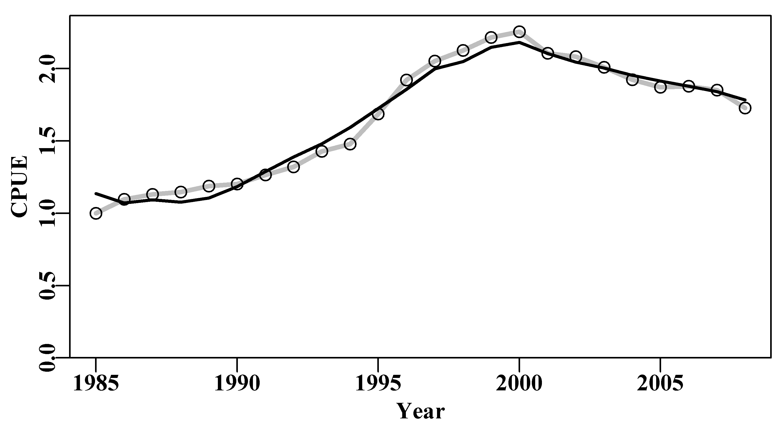
Figure 6.1: The optimum fit of the Schaefer surplus production model to the abdat data set plotted in linear-space (solid red-line). The grey line passes through the data points to clarify the difference with the predicted line.
6.2 Bootstrapping
Data sampled from a population are treated as being (assumed to be) representative of that population and of the underlying probability density distribution of expected sample values. This is a very important assumption first suggested by Efron (1979). He asked the question: when a sample contains or is all of the available information about a population, why not proceed as if the sample really is the population for purposes of estimating the sampling distribution of the test statistic? Thus, given an original sample of \(n\) observations, bootstrap samples would be random samples of \(n\) observations taken from the original sample with replacement. bootstrap samples (i.e., random re-sampling from the sample data values with replacement) are assumed to approximate the distribution of values that would have arisen from repeatedly sampling the original sampled population. Each of these bootstrapped samples is treated as an independent random sample from the original population. This resampling with replacement appears counter-intuitive to some, but can be used to fit standard errors, percentile confidence intervals, and to test hypotheses. The name bootstrap is reported to derive from the story The Adventures of Baron Munchausen, in which the Baron escaped drowning by pulling himself up by his own bootstraps and thereby escaping from a water well (Efron and Tibshirani, 1993).
Efron (1979) first suggested bootstrapping as a practical procedure and Bickel and Freedman (1981) provided a demonstration of the asymptotic consistency of the bootstrap (convergent behaviour as the number of bootstrap samples increased). Given this demonstration, the bootstrap approach has been applied to numerous standard applications, such as multiple regression (Freedman, 1981; ter Braak, 1992) and stratified sampling (Bickel and Freedman, 1984, who found a limitation). Efron eventually converted the material he had been teaching to senior-level students at Stanford into a general summary of progress (Efron and Tibshirani, 1993).
6.2.1 Empirical Probability Density Distributions
The assumption is that given a sample from a population, the non-parametric, maximum likelihood estimate of the population’s probability density distribution is the sample itself. That is, if the sample consists of \(n\) observations \((x_1, x_2, x_3,..., x_n)\), the maximum likelihood, non parametric estimator of the probability density distribution is the function that places probability mass \(1/n\) on each of the \(n\) observations \(x_i\). It must be emphasized that this is not saying that all values have equal likelihood, instead, it implies that each observation has equal likelihood of occurring, although there may be multiple observations having the same value (make sure you are clear about this distinction before proceeding!). If the population variable being sampled has a modal value then one expects, some of the time, to obtain the same or similar values near that mode more often that values out at the extremes of the samples distribution.
Bootstrapping consists of applying Monte Carlo procedures, sampling with replacement but from the original sample itself, as if it were a theoretical statistical distribution (analogous to the Normal, Gamma, and Beta distributions ). Sampling with replacement is consistent with a population that is essentially infinite. Therefore, we are treating the sample as representing the total population.
In summary, bootstrap methods are used to estimate the uncertainty around the value of a parameter or model output. This is done by summarizing many bootstrap parameter estimates from replicate samples derived from replacing the true population sample by one estimated from the original sample from the population.
6.3 A Simple Bootstrap Example
To gain an appreciation of how to implement a bootstrap in R it is sensible to start with a simple example. The Australian Northern prawn fishery, within the Gulf of Carpentaria and across to Joseph Bonaparte Bay, along the top right hand side of the continent, is a mixed fishery that captures multiple species of prawn (Dichmont et al, 2006; Robins and Somers, 1994). We will use an example of the catches of tiger prawns (Penaeus semisulcatus and P. esculentus) and endeavour prawns (Metapenaeus endeavouri and M. ensis) taken between 1970 to 1992. There appears to be a correlation between those catches, Figure(6.2), but there is a good deal of scatter in the data. The endeavour prawns are invariably a bycatch in the much more valuable tiger prawn fishery, and this is reflected in their relative catch quantities.
The prawn catch data are relatively noisy, which is not unexpected with prawn catches. That endeavour and tiger prawn catches are correlated should also not be surprising. The endeavour prawns are generally taken as bycatch in the more valuable tiger prawn fishery, so one would expect the total tiger prawn catch to have some relationship with the total catch of endeavour prawns. If, on the other hand, you were to plot the banana prawn catch relative to the tiger prawn catch no such relationship would be expected because these are two almost independent fisheries (mostly in the same areas) but one fished during daytime the other at night. Exploring such relationships in mixed fisheries can often leads to hypotheses concerning the possibility of interactions between species or between individual fisheries.
 #regression between catches of NPF prawn species Fig 6.2
data(npf)
model <- lm(endeavour ~ tiger,data=npf)
plot1(npf$tiger,npf$endeavour,type="p",xlab="Tiger Prawn (t)",
      ylab="Endeavour Prawn (t)",cex=0.9)
abline(model,col=1,lwd=2)
correl <- sqrt(summary(model)$r.squared)
pval <- summary(model)$coefficients[2,4]
label <- paste0("Correlation ",round(correl,5)," P = ",round(pval,8))
text(2700,180,label,cex=1.0,font=7,pos=4) 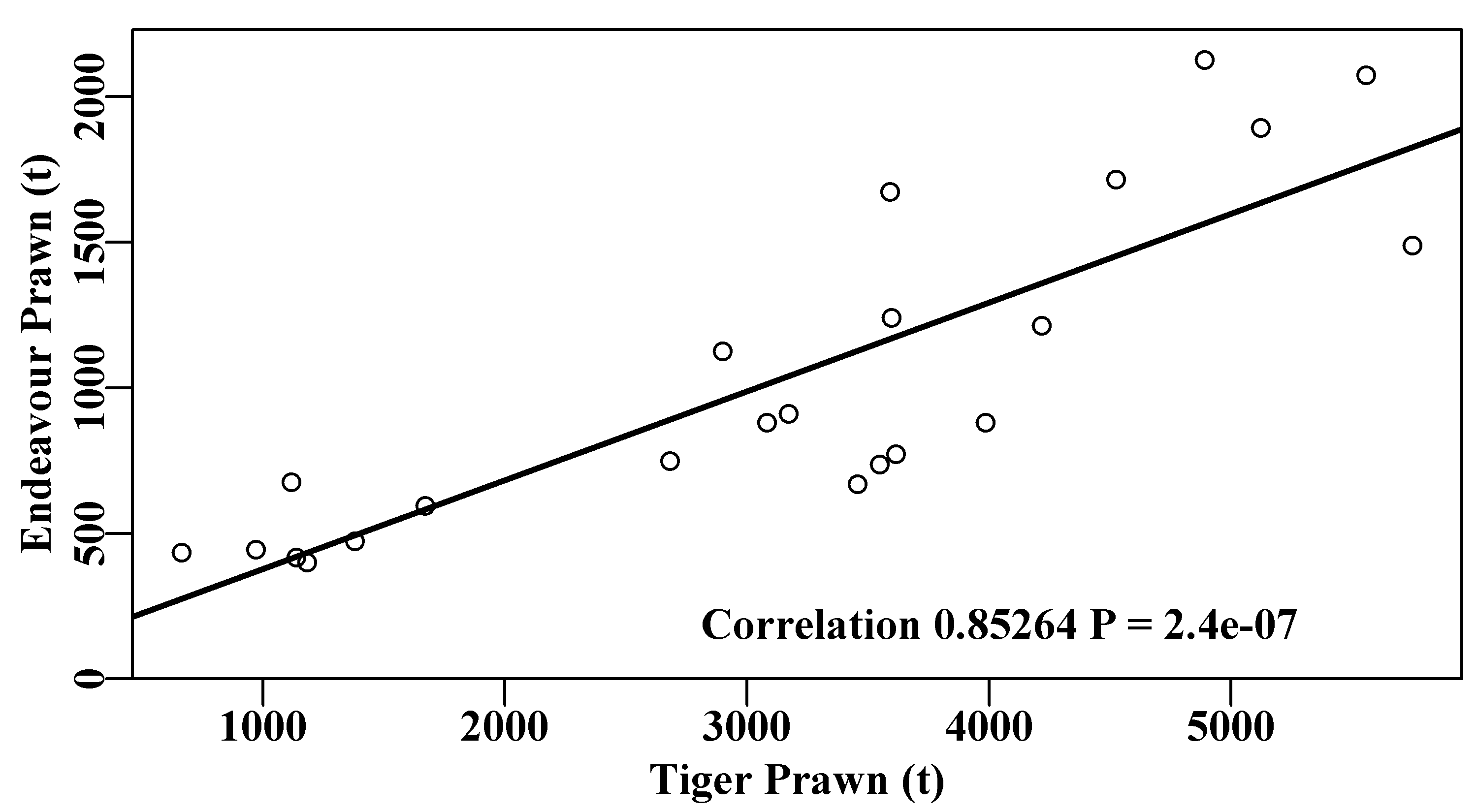
Figure 6.2: The positive correlation between the catches of endeavour and tiger prawns in the Australian Northern Prawn Fishery between 1970 - 1992 (data from Robins and Somers, 1994).
While the regression is highly significant (\(P < 1e^{-06}\)) the variability of the prawn catches means it is difficult to know with what confidence we can believe the correlation. Estimating confidence intervals around correlation coefficients is not usually straight-forward, fortunately, using bootstrapping, this can be done easily. We might take 5000 bootstrap samples of the 23 pairs of data from the original data set and each time calculate the correlation coefficient. Once finished we can calculate the mean and various quantiles. In this case we are not bootstrapping single values but pairs of values; we have to take pairs to maintain any intrinsic correlation. Re-sampling pairs can be done in R by first sampling the positions along each vector of data, with replacement, to identify which pairs to take for each bootstrap sample.
 # 5000 bootstrap estimates of correlation coefficient Fig 6.3
set.seed(12321)     # better to use a less obvious seed, if at all
N <- 5000                            # number of bootstrap samples
result <- numeric(N)          #a vector to store 5000 correlations
for (i in 1:N) {          #sample index from 1:23 with replacement
   pick <- sample(1:23,23,replace=TRUE)   #sample is an R function
   result[i] <- cor(npf$tiger[pick],npf$endeavour[pick])
}
rge <- range(result)                  # store the range of results
CI <- quants(result)     # calculate quantiles; 90%CI = 5% and 95%
restrim <- result[result > 0] #remove possible -ve values for plot
parset(cex=1.0)        # set up a plot window and draw a histogram
bins <- seq(trunc(range(restrim)[1]*10)/10,1.0,0.01)
outh <- hist(restrim,breaks=bins,main="",col=0,xlab="Correlation")
abline(v=c(correl,mean(result)),col=c(4,3),lwd=c(3,2),lty=c(1,2))
abline(v=CI[c(2,4)],col=4,lwd=2) # and 90% confidence intervals
text(0.48,400,makelabel("Range ",rge,sep="  ",sigdig=4),font=7,pos=4)
label <- makelabel("90%CI ",CI[c(2,4)],sep="  ",sigdig=4)
text(0.48,300,label,cex=1.0,font=7,pos=4) 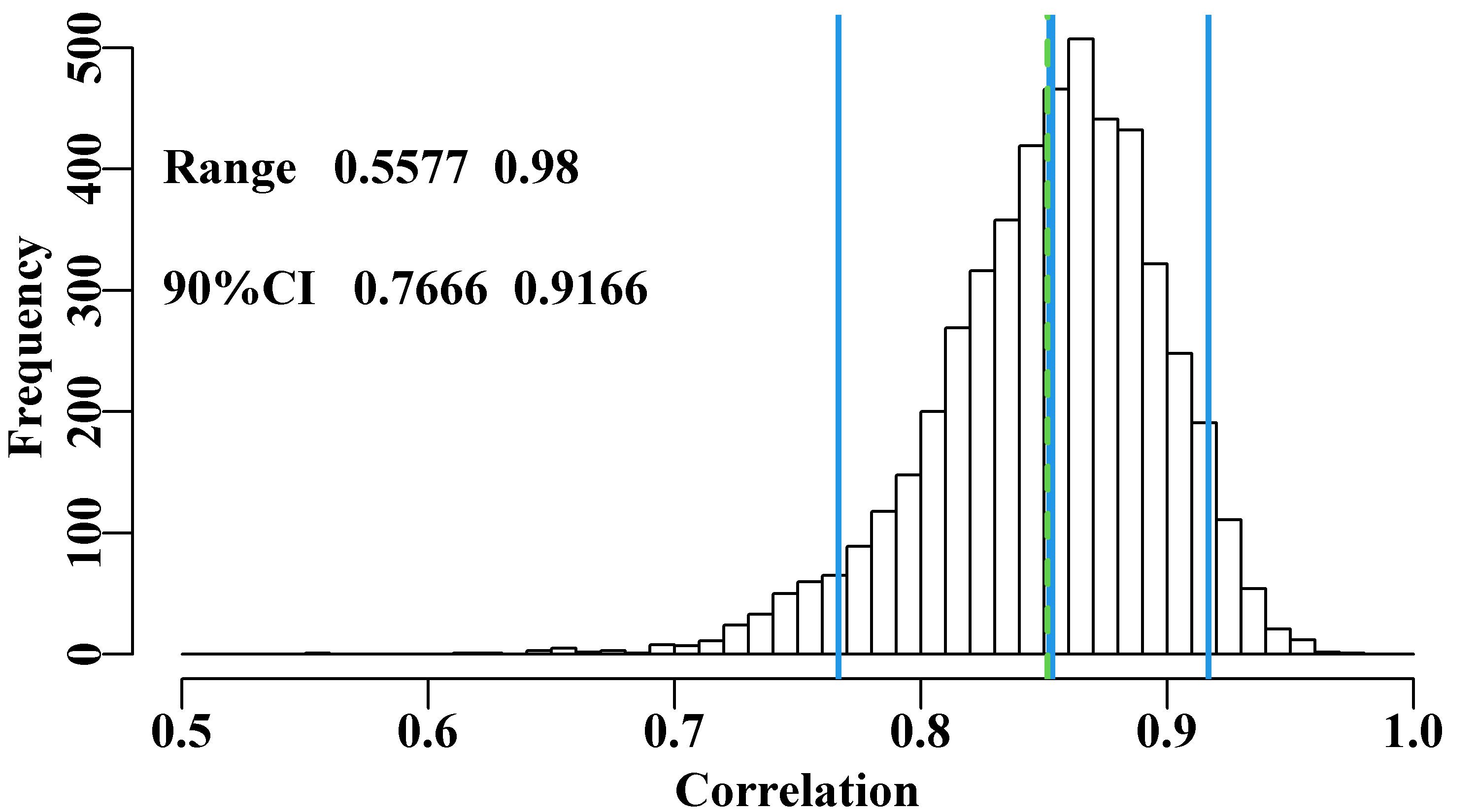
Figure 6.3: 5000 bootstrap estimates of the correlation between Endeavour and Tiger prawn catches with the original mean in dashed green and bootstrap mean and 90% CI in solid blue. Possible negative correlations have been removed for plotting purposes (though none occurred).
While the resulting distribution of correlation values is certainly skewed to the left, we can be confident that the high correlation in the original data is a fair representation of the available data on the relationship.
6.4 Bootstrapping Time-Series Data
Even though the prawn catches in the previous example were taken across a series of years the particular year in which the data arrived was not relevant to the correlation between them. Thus, we could just bootstrap the data pairs and continue with the analysis. However, when bootstrapping information concerning the population dynamics of a species it is necessary to maintain the time-series nature of the data, where the values (of numbers or biomass) in one year depend in some way on the values in the previous year. For example, in a surplus production model the order in which the observed data enter the analysis is a vital aspect of the stock dynamics, so naively bootstrapping data pairs is not a valid or sensible option. The solution we adopt is that we obtain an optimum model fit with its predicted cpue time-series and we then bootstrap the individual residuals at each point. In each cycle the bootstrap sampled residuals are applied to the optimum predicted values so as to generate a new bootstrapped ‘observed’ data series, which is then refitted. you will remember that the observed values can be derived from multiplying the optimum predicted cpue values by the log-normal residuals, Figure(6.1). Given the optimum solution from the original data the Log-Normal residual for a particular year \(t\) is:
\[\begin{equation} resid_t = {\frac{I_t}{\hat{I_t}}} = \exp\left(\log(I_t)-\log(\hat{I_t})\right) \tag{6.6} \end{equation}\]
where \(I_t\) refers to the observed cpue in year \(t\) and \(\hat{I_t}\) is the optimum predicted cpue in year \(t\). An optimum solution would imply a time-series of optimum predicted cpue values and a time-series of associated log-normal residuals. Given we are using multiplicative log-normal residuals, once we take a bootstrap sample of the residuals (random samples with replacement) we would need to multiple the optimum predicted cpue time-series by the bootstrap series of residuals. Log-Normal residuals would be expected to center around 1.0 with lower values constrained by zero and upper values not constrained; hence the skew that can occur with Log-Normal distributions.
\[\begin{equation} {I_t}^* = {\hat{I_t}} \times \left({\frac{I_t}{\hat{I_t}}}\right)^* = \exp \left( \log{(\hat{I_t})} + \left(\log{(I_t)}-\log{(\hat{I_t})}\right)^*\right) \tag{6.7} \end{equation}\]
where the \(*\) superscript denotes either a bootstrap value, as in \({I_t}^*\) or a bootstrap sample, as in \((I_t/{\hat{I_t}})^*\). Had we been using simple additive normal random residuals then we would have used the equation on the right but without the log-transformation and exponentiation. For the surplus production model the log-normal version can be implemented thus:
 # fitting Schaefer model with log-normal residuals with 24 years
data(abdat); logce <- log(abdat$cpue) # of abalone fisheries data
param <- log(c(r= 0.42,K=9400,Binit=3400,sigma=0.05)) #log values
bestmod <- nlm(f=negLL,p=param,funk=simpspm,indat=abdat,logobs=logce)
optpar <- bestmod$estimate      # these are still log-transformed
predce <- exp(simpspm(optpar,abdat))      #linear-scale pred cpue
optres <- abdat[,"cpue"]/predce     # optimum log-normal residual
optmsy <- exp(optpar[1])*exp(optpar[2])/4
sampn <- length(optres) # number of residuals and of years | year | catch | cpue | predce | optres | year | catch | cpue | predce | optres |
|---|---|---|---|---|---|---|---|---|---|
| 1985 | 1020 | 1.000 | 1.135 | 0.881 | 1997 | 655 | 2.051 | 1.998 | 1.027 |
| 1986 | 743 | 1.096 | 1.071 | 1.023 | 1998 | 494 | 2.124 | 2.049 | 1.037 |
| 1987 | 867 | 1.130 | 1.093 | 1.034 | 1999 | 644 | 2.215 | 2.147 | 1.032 |
| 1988 | 724 | 1.147 | 1.076 | 1.066 | 2000 | 960 | 2.253 | 2.180 | 1.033 |
| 1989 | 586 | 1.187 | 1.105 | 1.075 | 2001 | 938 | 2.105 | 2.103 | 1.001 |
| 1990 | 532 | 1.202 | 1.183 | 1.016 | 2002 | 911 | 2.082 | 2.044 | 1.018 |
| 1991 | 567 | 1.265 | 1.288 | 0.983 | 2003 | 955 | 2.009 | 2.003 | 1.003 |
| 1992 | 609 | 1.320 | 1.388 | 0.951 | 2004 | 936 | 1.923 | 1.952 | 0.985 |
| 1993 | 548 | 1.428 | 1.479 | 0.966 | 2005 | 941 | 1.870 | 1.914 | 0.977 |
| 1994 | 498 | 1.477 | 1.593 | 0.927 | 2006 | 954 | 1.878 | 1.878 | 1.000 |
| 1995 | 480 | 1.685 | 1.724 | 0.978 | 2007 | 1027 | 1.850 | 1.840 | 1.005 |
| 1996 | 424 | 1.920 | 1.856 | 1.034 | 2008 | 980 | 1.727 | 1.782 | 0.969 |
Typically one would conduct at 1000 bootstrap samples as a minimum. Note we have set bootfish to a matrix rather than a data.frame. If you remove the as.matrix so that bootfish becomes a data.frame instead compare the time it takes to do that and see the advantage of using a matrix in computer-intensive work.
 # 1000 bootstrap Schaefer model fits; takes a few seconds
start <- Sys.time() # use of as.matrix faster than using data.frame
bootfish <- as.matrix(abdat)  # and avoid altering original data
N <- 1000;   years <- abdat[,"year"] # need N x years matrices
columns <- c("r","K","Binit","sigma")
results <- matrix(0,nrow=N,ncol=sampn,dimnames=list(1:N,years))
bootcpue <- matrix(0,nrow=N,ncol=sampn,dimnames=list(1:N,years))
parboot <- matrix(0,nrow=N,ncol=4,dimnames=list(1:N,columns))
for (i in 1:N) {  # fit the models and save solutions
  bootcpue[i,] <- predce * sample(optres, sampn, replace=TRUE)
  bootfish[,"cpue"] <- bootcpue[i,] #calc and save bootcpue
  bootmod <- nlm(f=negLL,p=optpar,funk=simpspm,indat=bootfish,
        logobs=log(bootfish[,"cpue"]))
  parboot[i,] <- exp(bootmod$estimate)  #now save parameters
  results[i,] <- exp(simpspm(bootmod$estimate,abdat))  #and predce
}
cat("total time = ",Sys.time()-start, "seconds   \n")
# total time = 4.584487 secondsOn the computer I used when writing this, the bootstrap took about 4 seconds to run. That was made up of taking the bootstrap sample of 24 years and fitting the surplus production model to the sample, with each iteration taking about 0.004 seconds. This is worth knowing with any computer-intensive method that requires fitting models or calculating likelihoods many times over. Knowing the time expected to run the analysis assists in designing the scale of those analyses. The surplus production model takes very little time to fit, but if a complex age-structured model takes say 1 minute to fit then 1000 replicates (a minimum by modern standards, and more would invariably provide for more precise results) would take over 16 hours! There is still very much a place for optimizing the speed of code where possible; We will discuss ways of optimizing for speed using the Rcpp package later in this chapter when we discuss approximating Bayesian posterior distributions.
The bootstrap samples can usually be plotted to provide a visual impression of the quality of a model fit, Figure(6.4). It would be possible to apply the quants() function to the results matrix containing the bootstrap estimates of the optimum predicted cpue and thereby plot percentile confidence intervals within the grey bounds of the plot, but here the outcome is so tight that it would mostly just make the plot untidy.
The values in years 1988 and 1989 have the largest residuals and so can never be exceeded.
 # bootstrap replicates in grey behind main plot Fig 6.4
plot1(abdat[,"year"],abdat[,"cpue"],type="n",xlab="Year",
      ylab="CPUE") # type="n" just lays out an empty plot
for (i in 1:N)      # ready to add the separate components
  lines(abdat[,"year"],results[i,],lwd=1,col="grey")
points(abdat[,"year"],abdat[,"cpue"],pch=16,cex=1.0,col=1)
lines(abdat[,"year"],predce,lwd=2,col=1) 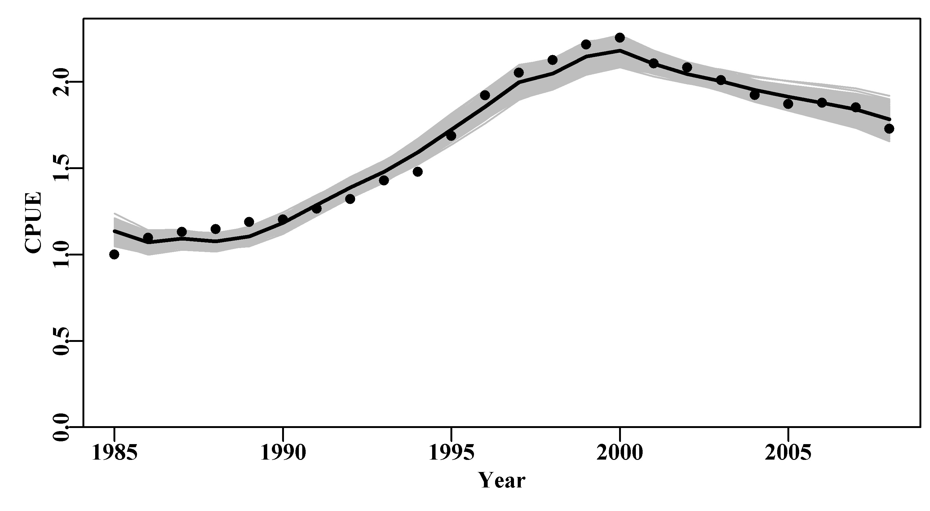
Figure 6.4: 1000 bootstrap estimates of the optimum predicted cpue from the abdat data set for an abalone fishery. Black points are the original data, the black line is the optimum predicted cpue from the original model fit, and the grey trajectories are the 1000 bootstrap estimates of the predicted cpue.
With 1000 replicates there remain some less well-defined parts in each plot, especially in the later years, for this reason one must be careful not just to plot an outline of the grey trajectories combined (perhaps defined using chull()), otherwise relatively thin areas of the predicted trajectory space may become un-noticed. Generally, doing 2000 - 5000 bootstraps may appear to be overkill, but to avoid actual gaps in the trajectory space then such numbers can be advantageous. Such diagrams can be helpful, but the principle findings relate to the model parameters and outputs, such as the MSY. We can use the bootstrap estimates of \(r\) and \(K\) to estimate the bootstrap estimates of MSY and all can be plotted as histograms and, using quants(), we can identify whatever percentile confidence bounds we wish. quants() defaults to extracting the 0.025, 0.05, 0.5, 0.95, and 0.975 quantiles (other ranges can be entered), allowing for the identification of the central 95% and 90% confidence bounds as well as the median.
 #histograms of bootstrap parameters and model outputs Fig 6.5
dohist <- function(invect,nmvar,bins=30,bootres,avpar) { #adhoc
  hist(invect[,nmvar],breaks=bins,main="",xlab=nmvar,col=0)
  abline(v=c(exp(avpar),bootres[pick,nmvar]),lwd=c(3,2,3,2),
         col=c(3,4,4,4))
}
msy <- parboot[,"r"]*parboot[,"K"]/4 #calculate bootstrap MSY
msyB <- quants(msy)        #from optimum bootstrap parameters
parset(plots=c(2,2),cex=0.9)
bootres <- apply(parboot,2,quants); pick <- c(2,3,4) #quantiles
dohist(parboot,nmvar="r",bootres=bootres,avpar=optpar[1])
dohist(parboot,nmvar="K",bootres=bootres,avpar=optpar[2])
dohist(parboot,nmvar="Binit",bootres=bootres,avpar=optpar[3])
hist(msy,breaks=30,main="",xlab="MSY",col=0)
abline(v=c(optmsy,msyB[pick]),lwd=c(3,2,3,2),col=c(3,4,4,4)) 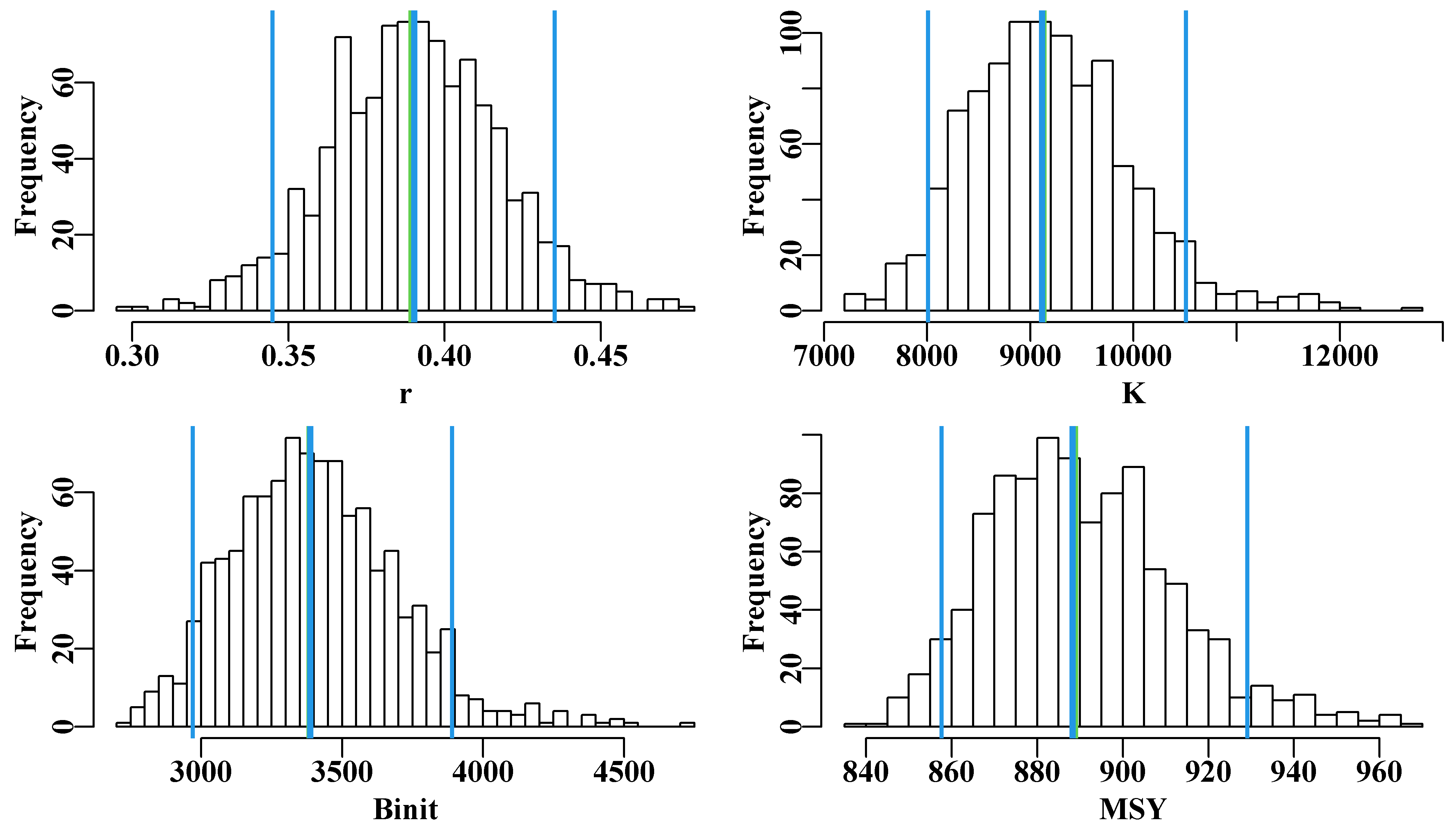
Figure 6.5: The 1000 bootstrap estimates of each of the first three model parameters and MSY as histograms. In each plot the two fine outer lines define the inner 90% confidence bounds around the median, the central vertical line denotes the optimum estimates, but these are generally immediately below the medians, except for the Binit.
Once again, with only 1000 bootstrap estimates, the histograms are not really smooth representations of the empirical distribution for all values of the parameters and outputs in question. More replicates would smooth the outputs and stabilize the quantile or percentile confidence bounds. Even so it is possible to generate an idea of the the precision with which such parameters and outputs are generated.
6.4.1 Parameter Correlation
We can also examine any correlations between the parameters and model outputs by plotting each against the others using the R function pairs(). The expected strong correlation between \(r\), \(K\), and \(B_\text{init}\) is immediately apparent. The lack of correlations with the value of sigma is typical of how variation within the residuals should behave. More interesting is the fact that the \(msy\), which is a function of \(r\) and \(K\), exhibits a reduced correlation with the other parameters. This reduction is a reflection of the negative correlation between \(r\) and \(K\) which acts to cancel out the effects of changes to each other. We can thus have similar values of \(msy\) for rather different values of \(r\) and \(K\). The use of the rgb() function to vary the intensity of colour relative to the density of points in Figure(6.6) could also be used when plotting the 1000 trajectories to make it possible to identify the most common trajectories in Figure(6.4).
 #relationships between parameters and MSY  Fig 6.6
parboot1 <- cbind(parboot,msy)
 # note rgb use, alpha allows for shading, try 1/15 or 1/10
pairs(parboot1,pch=16,col=rgb(red=1,green=0,blue=0,alpha = 1/20)) 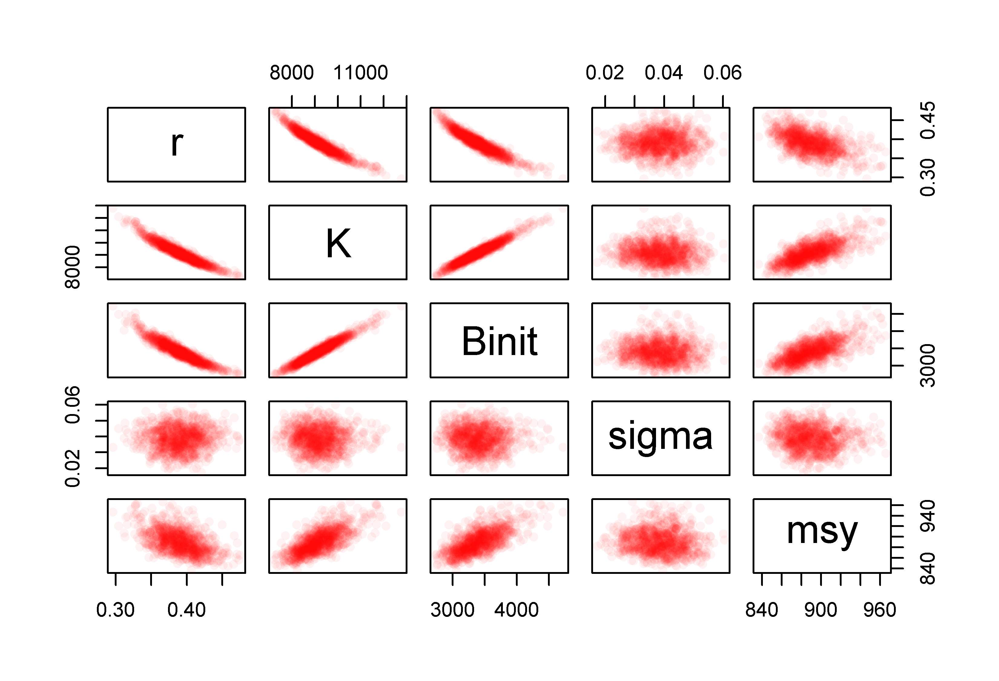
Figure 6.6: The relationships between the 1000 bootstrap estimates of the optimum parameter estimates and the derived MSY values for the Schaefer model fitted to the abdat data-set. Full colour intensity derived from a minimum of 20 points. More bootstrap replicates would fill out these intensity plots.
6.5 Asymptotic Errors
The concept of confidence intervals (often 90% or 95% CI) is classically defined in Snedecor and Cochran (1967, 1989), and very many others, as:
\[\begin{equation} \bar{x}\pm {{t}_{\nu}}\frac{\sigma }{\sqrt{n}} \tag{6.8} \end{equation}\]
where \(\bar{x}\) is the mean of the sample of \(n\) observations (in fact, any parameter estimate), \(\sigma\) is the sample standard deviation, a measure of sample variation, and \(t_{\nu}\) is the t-distribution with \(\nu=(n-1)\) degrees of freedom (see also rt(), dt(), pt(), and qt()). If we had multiple independent samples it would be possible to estimate the standard deviation of the group of sample means. The \({\sigma}/{\sqrt{n}}\) is known as the standard error of the variable \(x\), and is one analytical way of estimating the expected standard deviation of a set of sample means when there is only one sample (bootstrapping to generate multiple samples is another way, though then it would be better to use percentile CI directly). As we are dealing with normally distributed data, such classical confidence intervals are distributed symmetrically around the mean or expectation. This is fine when dealing with single samples but the problem we are attempting to solve is to determine with what confidence we can trust the parameter estimates and model outputs obtained when fitting a multi-parameter model to data.
In such circumstance asymptotic standard errors as in Equ(6.8) can be produced by estimating the variance-covariance matrix for the model parameters in the vicinity of the optimum parameter set. In practice, the gradient of the maximum likelihood or sum of squares surface at the optimum of a multi-parameter model is assumed to approximate a multivariate normal distributions and can be used to characterize any relationships between the various parameters. These relationships are the basis of generating the required variance-covariance matrix. This matrix is used to generate standard errors for each parameter, as in Equ(6.8), and these can then be used to estimate approximate confidence intervals for the parameters. They are approximate because this method assumes that the fitted surface near the optimum is regular and smooth, and that the surface is approximately multi-variate normal (= symmetrical) near the optimum. This means the resulting standard errors will be symmetric around the optimal solution, which may or may not be appropriate. Nevertheless, as a first approximation, asymptotic standard errors can provide an indication of the inherent variation around the parameter estimates.
The Hessian matrix describes the local curvature or gradient of the maximum likelihood surface near the optimum. More formally, this is made up of the second-order partial derivatives of the function describing the likelihood of different parameter sets. That is, the rate of change of the rate of change of each parameter relative to itself and all the other parameters. All Hessian matrices are square. If we only consider \(r\), \(K\), and \(Binit\), three of the four parameters of the Schaefer model, Equ(6.1), the Hessian describing these three would be:
\[\begin{equation} H(f)=\left\{ \begin{matrix} \frac{{{\partial }^{2}}f}{\partial {{r}^{2}}} & \frac{{{\partial }^{2}}f}{\partial r\partial K} & \frac{{{\partial }^{2}}f}{\partial r\partial {{B}_{init}}} \\ \frac{{{\partial }^{2}}f}{\partial r\partial K} & \frac{{{\partial }^{2}}f}{\partial {{K}^{2}}} & \frac{{{\partial }^{2}}f}{\partial K\partial {{B}_{init}}} \\ \frac{{{\partial }^{2}}f}{\partial r\partial {{B}_{init}}} & \frac{{{\partial }^{2}}f}{\partial K\partial {{B}_{init}}} & \frac{{{\partial }^{2}}f}{\partial B_{init}^{2}} \\ \end{matrix} \right\} \tag{6.9} \end{equation}\]
If the function \(f\), for which we are calculating the second-order partial differentials, uses log-likelihoods to fit the model to the data then the variance-covariance matrix is the inverse of the Hessian matrix. However, and note this well, if the \(f\) function uses least-squares to conduct the analysis then formally the variance-covariance matrix is the product of the residual variance at the optimum fit and the inverse of the Hessian matrix. The residual variance reflects the number of parameters estimated:
\[\begin{equation} S{{x}^{2}}=\frac{{{\sum{\left( x-\hat{x} \right)}}^{2}}}{n-p} \tag{6.10} \end{equation}\]
which is the sum-of-squared deviations, between the observed and predicted values, divided by the number of observations (\(n\)) minus the number of parameters (\(p\)).
Thus, either the variance-covariance matrix (\(\mathbf{A}\)) is estimated by inverting the Hessian, \(\mathbf{A}=\mathbf{H}^{-1}\) (when using maximum likelihood), or, when using least-squares, we multiply the elements of the inverse of the Hessian by the residual variance:
\[\begin{equation} \mathbf{A}=S{{x}^{2}}{{\mathbf{H}}^{-1}} \tag{6.11} \end{equation}\]
Here we will focus on using maximum likelihood methods but it is worthwhile knowing the difference in procedure between using maximum likelihood and least squares methodologies just in case (it is recommended to always use maximum likelihood when using asymptotic errors).
The estimate of the standard error for each parameter in the \(\theta\) vector is obtained by taking the square root of the diagonal elements (the variances) of the variance-covariance matrix:
\[\begin{equation} StErr(\theta)=\sqrt{diag(\mathbf{A})} \tag{6.12} \end{equation}\]
In Excel we used the method of finite differences to estimate the Hessian (Haddon, 2011) but this approach does not always perform well with strongly correlated parameters. Happily, in R many of the non-linear solvers available provide the option of automatically generating an estimate of the Hessian when fitting a model.
 #Fit Schaefer model and generate the Hessian
data(abdat)
param <- log(c(r= 0.42,K=9400,Binit=3400,sigma=0.05))
 # Note inclusion of the option hessian=TRUE in nlm function
bestmod <- nlm(f=negLL,p=param,funk=simpspm,indat=abdat,
               logobs=log(abdat[,"cpue"]),hessian=TRUE)
outfit(bestmod,backtran = TRUE) #try typing bestmod in console
 # Now generate the confidence intervals
vcov <- solve(bestmod$hessian)      # solve inverts matrices
sterr <- sqrt(diag(vcov)) #diag extracts diagonal from a matrix
optpar <- bestmod$estimate      #use qt for t-distrib quantiles
U95 <- optpar + qt(0.975,20)*sterr # 4 parameters hence
L95 <- optpar - qt(0.975,20)*sterr # (24 - 4) df
cat("\n               r      K     Binit    sigma \n")
cat("Upper 95% ",round(exp(U95),5),"\n") # backtransform
cat("Optimum   ",round(exp(optpar),5),"\n")#\n =linefeed in cat
cat("Lower 95% ",round(exp(L95),5),"\n")
# nlm solution:
# minimum : -41.37511
# iterations : 20
# code : 2 >1 iterates in tolerance, probably solution
# par gradient transpar
# 1 -0.9429555 6.707523e-06 0.38948
# 2 9.1191569 -9.225209e-05 9128.50173
# 3 8.1271026 1.059296e-04 3384.97779
# 4 -3.1429030 -8.161433e-07 0.04316
# hessian :
# [,1] [,2] [,3] [,4]
# [1,] 3542.8630987 2300.305473 447.63247 -0.3509669
# [2,] 2300.3054733 4654.008776 -2786.59928 -4.2155105
# [3,] 447.6324677 -2786.599276 3183.93947 -2.5662898
# [4,] -0.3509669 -4.215511 -2.56629 47.9905538
#
# r K Binit sigma
# Upper 95% 0.45025 10948.12 4063.59 0.05838
# Optimum 0.38948 9128.502 3384.978 0.04316
# Lower 95% 0.33691 7611.311 2819.693 0.03196.5.1 Uncertainty about the Model Outputs
Asymptotic standard errors can also provide approximate confidence intervals around the model outputs, such as the MSY estimate, although this requires a somewhat different approach. This uses the assumption that the log-likelihood surface about the optimum solution is approximated by a multi-variate Normal distribution. This is usually defined as:
\[\begin{equation} \text{Multi-Variate Normal} = N \left( {\mu}, {\Sigma} \right) \tag{6.13} \end{equation}\]
where, in the cases considered here, \({\mu}\) is the vector of optimal parameter estimates (a vector of means), and \({\Sigma}\) is the variance-covariance matrix for the vector of optimum parameters.
Once these inputs are estimated, we can generate random parameter vectors by sampling from the estimated multi-variate Normal distribution that has a mean of the optimum parameter estimates and a variance-covariance matrix estimated from the inverse Hessian. Such random parameter vectors can be used, in the same way as with bootstrap parameter vectors, to generate percentile confidence intervals around parameters and model outputs. Using the multi-variate normal (some write it as multivariate normal) any parameter correlations between parameters are automatically accounted for.
6.5.2 Sampling from a Multi-Variate Normal Distribution
Base R does not have functions for working with the multi-variate Normal distribution, but one can use a couple of R packages that include a suitable function. The MASS library (Venables and Ripley, 2002) includes a suitable random number generator while the mvtnorm library has an even wider array of multi-variate probability density functions. Here we will use mvtnorm.
 # Use multi-variate normal to generate percentile CI    Fig 6.7
library(mvtnorm) # use RStudio, or install.packages("mvtnorm")
N <- 1000 # number of multi-variate normal parameter vectors
years <- abdat[,"year"];  sampn <- length(years)  # 24 years
mvncpue <- matrix(0,nrow=N,ncol=sampn,dimnames=list(1:N,years))
columns <- c("r","K","Binit","sigma")
 # Fill parameter vectors with N vectors from rmvnorm
mvnpar <- matrix(exp(rmvnorm(N,mean=optpar,sigma=vcov)),
                 nrow=N,ncol=4,dimnames=list(1:N,columns))
 # Calculate N cpue trajectories using simpspm
for (i in 1:N) mvncpue[i,] <- exp(simpspm(log(mvnpar[i,]),abdat))
msy <- mvnpar[,"r"]*mvnpar[,"K"]/4 #N MSY estimates
 # plot data and trajectories from the N parameter vectors
plot1(abdat[,"year"],abdat[,"cpue"],type="p",xlab="Year",
      ylab="CPUE",cex=0.9)
for (i in 1:N) lines(abdat[,"year"],mvncpue[i,],col="grey",lwd=1)
points(abdat[,"year"],abdat[,"cpue"],pch=16,cex=1.0)#orig data
lines(abdat[,"year"],exp(simpspm(optpar,abdat)),lwd=2,col=1) 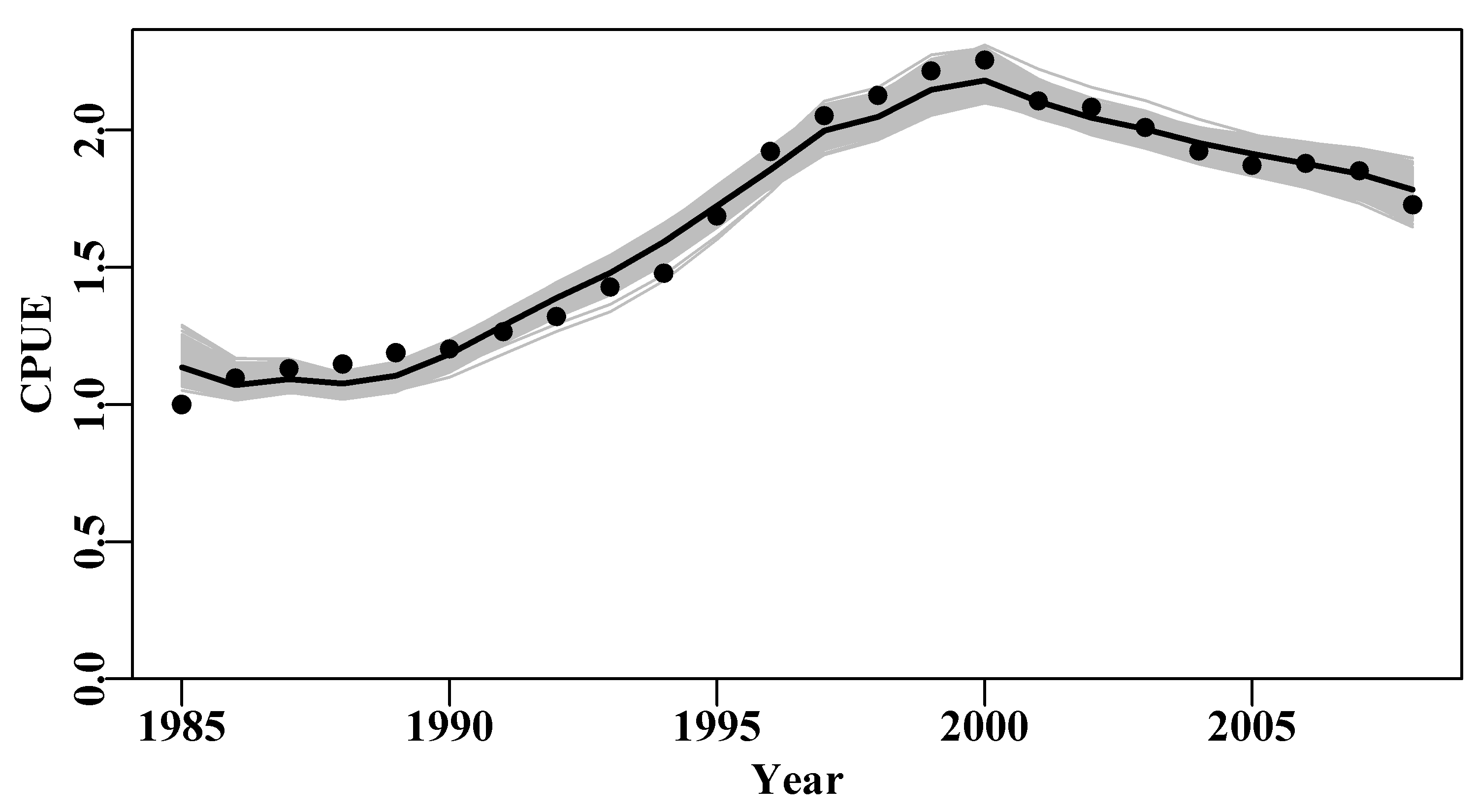
Figure 6.7: The 1000 predicted cpue trajectories derived from random parameter vectors sampled from the multi-variate Normal distribution defined by the optimum parameters and their related variance-covariance matrix.
As with the bootstrap example, even a sample of 1000 trajectories were insufficient to fill in the trajectory space completely so that some regions were less dense than others. More replicates might fill in those spaces, Figure(6.7). The use of rgb() with the bootstrap cpue lines would also help identify less dense regions.
We can also plot out the implied parameter correlations (if any) using pairs(), as we did for the bootstrap samples, Figure(6.8). Here, however, the results appear to be relatively evenly and cleanly distributed, relative to those from the bootstrapping process, Figure(6.6). The smoother distributions reflect the fact the values are all sampled from a well-defined probability density function rather than an empirical distribution. It would be reasonable to argue that the bootstrapping procedure would be expected to provide a more accurate representation of the properties of the data. However, which set of results better represents the population from which the original sample came from is less simple to answer with confidence. What really matters is whether their summary statistics differ and, considering Table(6.2), we can see that while the exact details of the distributions for each parameter and model output differ slightly, there does not appear to be any single pattern of one being wider or narrower than the other in a consistent fashion.
 #correlations between parameters when using mvtnorm Fig 6.8
pairs(cbind(mvnpar,msy),pch=16,col=rgb(red=1,0,0,alpha = 1/10)) 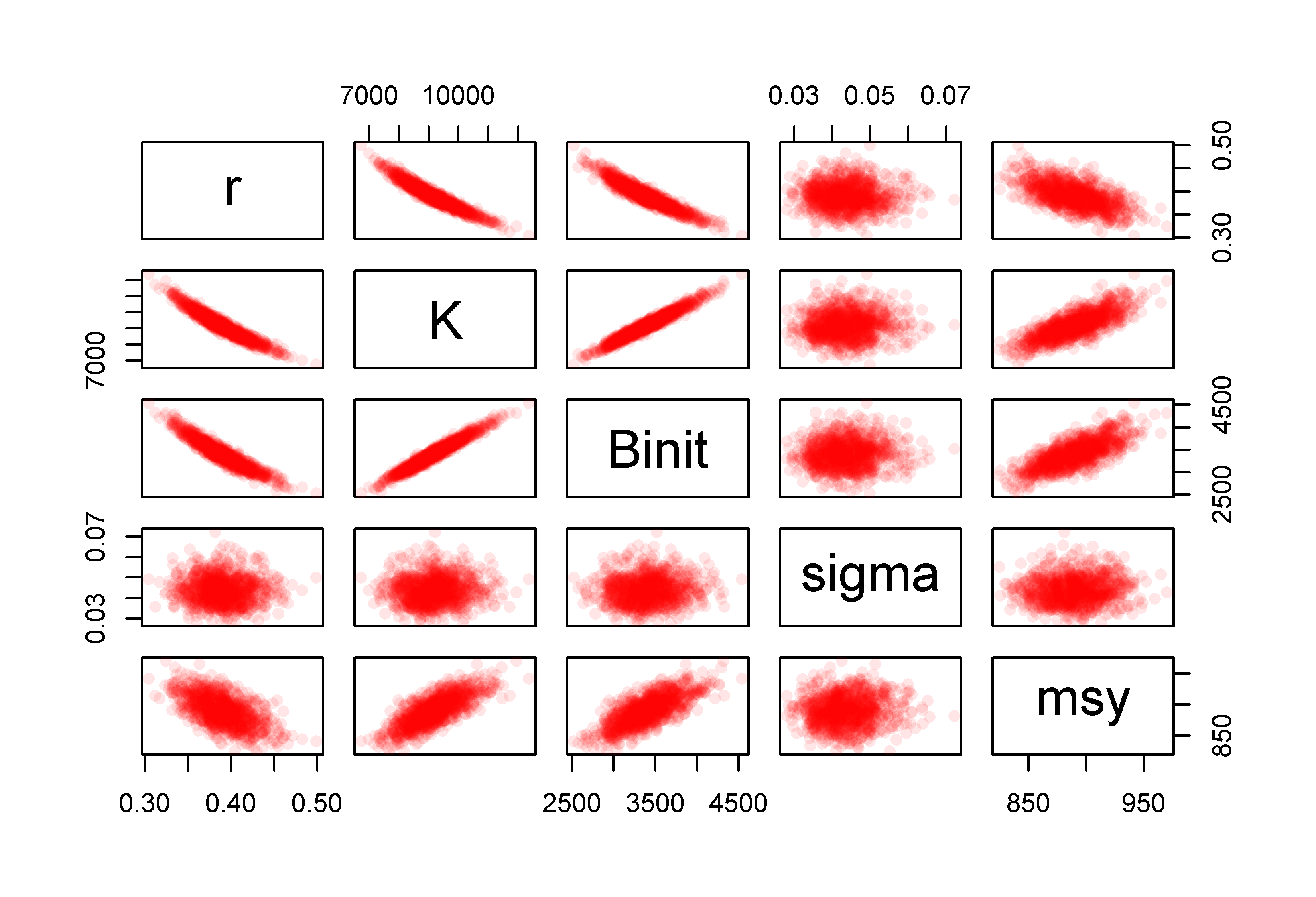
Figure 6.8: The relationships between the 1000 parameter estimates sampled from the estimated multi-variate Normal distribution assumed to surround the optimum parameter estimates and the derived MSY values for the Schaefer model fitted to the abdat data set.
Finally, we can illustrate the asymptotic confidence intervals by plotting out an array of histograms for parameters and MSY along with their predicted confidence bounds, Figure(6.9). In this case we use the inner 90% bounds. The mean and median values are even closer than with the bootstrapping example, which is a further reflection of the symmetry of using the multi-variate Normal distribution.
 #N parameter vectors from the multivariate normal Fig 6.9
mvnres <- apply(mvnpar,2,quants)  # table of quantiles
pick <- c(2,3,4)   # select rows for 5%, 50%, and 95%
meanmsy <- mean(msy)     # optimum bootstrap parameters
msymvn <- quants(msy)   # msy from mult-variate normal estimates

plothist <- function(x,optp,label,resmvn) {
  hist(x,breaks=30,main="",xlab=label,col=0)
  abline(v=c(exp(optp),resmvn),lwd=c(3,2,3,2),col=c(3,4,4,4))
} # repeated 4 times, so worthwhile writing a short function
par(mfrow=c(2,2),mai=c(0.45,0.45,0.05,0.05),oma=c(0.0,0,0.0,0.0))
par(cex=0.85, mgp=c(1.35,0.35,0), font.axis=7,font=7,font.lab=7)
plothist(mvnpar[,"r"],optpar[1],"r",mvnres[pick,"r"])
plothist(mvnpar[,"K"],optpar[2],"K",mvnres[pick,"K"])
plothist(mvnpar[,"Binit"],optpar[3],"Binit",mvnres[pick,"Binit"])
plothist(msy,meanmsy,"MSY",msymvn[pick]) 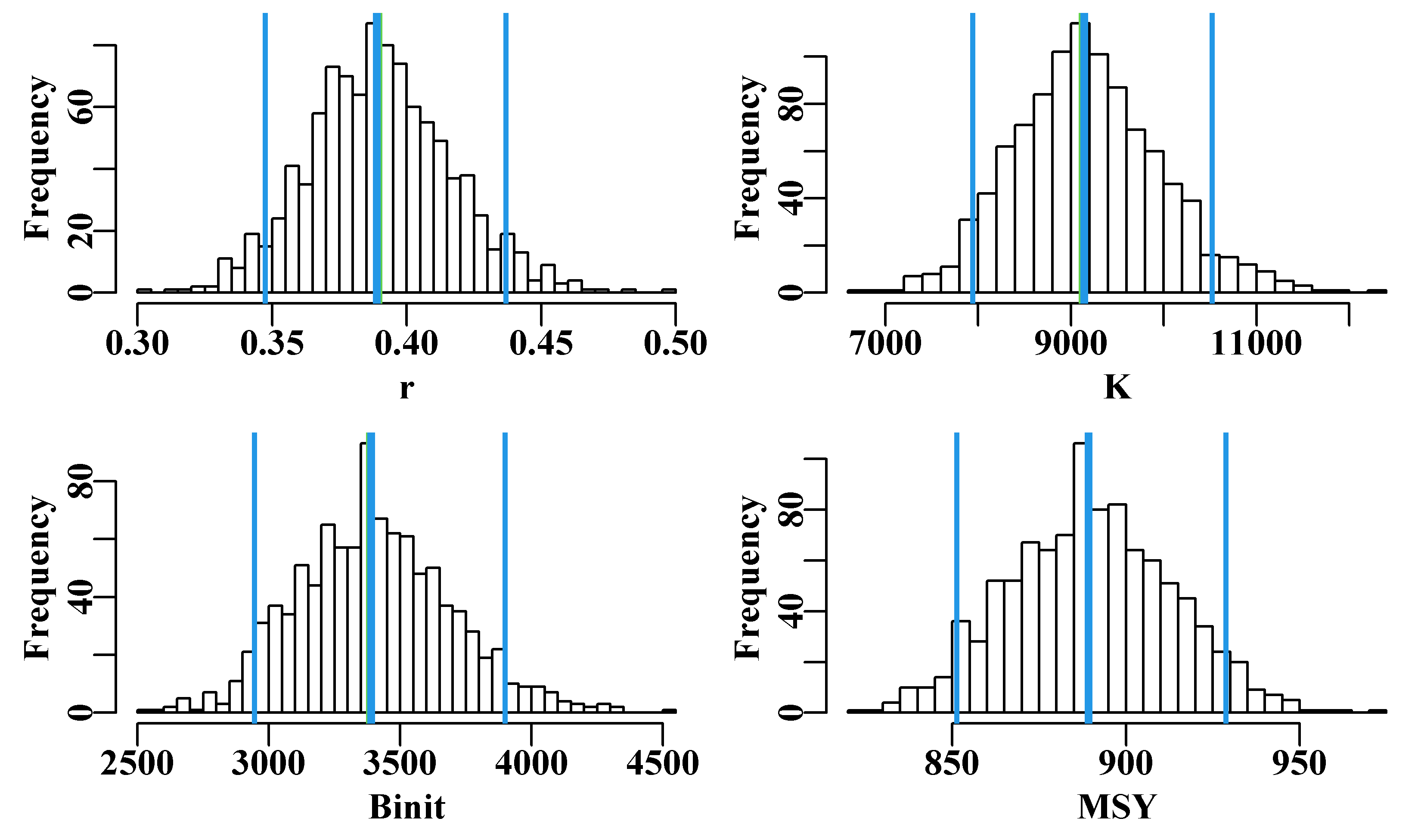
Figure 6.9: Histograms of the 1000 parameter estimates for r, K, Binit, and the derived MSY, from the multi-variate normal estimated at the optimum solution. In each plot, the green line denotes the arithmetic mean, the thick blue line the median, and the two fine blue lines the inner 90% confidence bounds around the median.
| r | K | Binit | sigma | msyB | |
|---|---|---|---|---|---|
| 2.5% | 0.3353 | 7740.636 | 2893.714 | 0.0247 | 854.029 |
| 5% | 0.3449 | 8010.341 | 2970.524 | 0.0263 | 857.660 |
| 50% | 0.3903 | 9116.193 | 3387.077 | 0.0385 | 888.279 |
| 95% | 0.4353 | 10507.708 | 3889.824 | 0.0501 | 929.148 |
| 97.5% | 0.4452 | 11003.649 | 4055.071 | 0.0523 | 940.596 |
| r | K | Binit | sigma | msymvn | |
|---|---|---|---|---|---|
| 2.5% | 0.3387 | 7717.875 | 2882.706 | 0.0328 | 844.626 |
| 5% | 0.3474 | 7943.439 | 2945.264 | 0.0342 | 851.257 |
| 50% | 0.3889 | 9145.146 | 3389.279 | 0.0432 | 889.216 |
| 95% | 0.4368 | 10521.651 | 3900.034 | 0.0550 | 928.769 |
| 97.5% | 0.4435 | 10879.571 | 4031.540 | 0.0581 | 934.881 |
6.6 Likelihood Profiles
The name ‘Likelihood Profile’ is suggestive of the process used to generate these analyses. In this chapter we have already optimally fitted a four parameter model and examined ways of characterizing the uncertainty around those parameter estimates. One can imagine selecting a single parameter from the four and fixing its value a little way away from its optimum value. If one then refitted the model holding the selected parameter fixed but allowing the others to vary we can imagine that a new optimum solution would be found for the remaining parameters but that the negative log-likelihood would be larger than the optimum obtained when all four parameters were free to vary. This process is the essential idea behind the generation of likelihood profiles
The idea is to fit a model using maximum likelihood methods (minimization of the -ve log-likelihood) but only fitting specific parameters while keeping others constant at values surrounding the optimum value. In this way new “optimum” fits can be obtained while a given parameter has been given an array of fixed values. We can thus determine the influence of the fixed parameter(s) on the total likelihood of the model fit. An example may help make the process clear.
Once again using the Schaefer surplus production model on the abdat fishery data we obtain the optimum parameters r = 0.3895, K = 9128.5, Binit = 3384.978, and sigma = 0.04316, which imply an MSY = 888.842t.
 #Fit the Schaefer surplus production model to abdat
data(abdat); logce <- log(abdat$cpue)    # using negLL
param <- log(c(r= 0.42,K=9400,Binit=3400,sigma=0.05))
optmod <- nlm(f=negLL,p=param,funk=simpspm,indat=abdat,logobs=logce)
outfit(optmod,parnames=c("r","K","Binit","sigma"))
# nlm solution:
# minimum : -41.37511
# iterations : 20
# code : 2 >1 iterates in tolerance, probably solution
# par gradient transpar
# r -0.9429555 6.707523e-06 0.38948
# K 9.1191569 -9.225209e-05 9128.50173
# Binit 8.1271026 1.059296e-04 3384.97779
# sigma -3.1429030 -8.161433e-07 0.04316The problem of how to fit a restricted number of model parameters, while holding the remainder constant is solved by modifying the function used to minimize the negative log-likelihood. Instead of using the negLL() function to calculate the negative log-likelihood of the Log-Normally distributed cpue values we have used the MQMF function negLLP() (negative log-likelihood profile). This adds the capacity to fix some of the parameters while solving for an optimum solution by only varying the non-fixed parameters. If we look at the R code for the negLLP() function and compare it to the negLL() function we can see that the important differences, other than in the arguments, is in the three lines of code before the logpred statement. See the help (?) page for further details, though I hope you can see straight away that if you ignore the initpar and notfixed arguments negLLP() should give the same answer as negLL().
 #the code for MQMF's negLLP function
negLLP <- function(pars, funk, indat, logobs, initpar=pars,
                   notfixed=c(1:length(pars)),...) {
  usepar <- initpar  #copy the original parameters into usepar
  usepar[notfixed] <- pars[notfixed] #change 'notfixed' values
  npar <- length(usepar)
  logpred <- funk(usepar,indat,...) #funk uses the usepar values
  pick <- which(is.na(logobs))  # proceed as in negLL
  if (length(pick) > 0) {
    LL <- -sum(dnorm(logobs[-pick],logpred[-pick],exp(pars[npar]),
                     log=T))
  } else {
    LL <- -sum(dnorm(logobs,logpred,exp(pars[npar]),log=T))
  }
  return(LL)
} # end of negLLP
For example, to determine the precision with which the \(r\) parameter has been estimated we can force it to take on constant values from about 0.3 to 0.45 while fitting the other parameters to obtain an optimum fit and then plot up the total likelihood with respect to the given \(r\) value. As with all model fitting in R we need two functions, one to generate the required predicted values and the other to act as a wrapper to bring the observed and predicted values together to be used by the minimizer, in this case nlm(). To proceed we use negLLP() to allow for some parameters to be fixed in value. nlm() works by iteratively modifying the input parameters in the direction that ought to improve the model fit and then feeding those parameters back into the input model function that generates the predicted values against which the observed are compared. We therefore need to arrange the model function to continually return the particular parameter values that we want fixed to the initial set values. The code in negLLP() is one way in which to do this. The changes required include having an independent set of the original pars in initpar, which must contain the specified fixed parameters, and a notfixed argument identifying which values from initpar to over-write with values from pars, which will become modified by nlm.
It is best practice to check that negLLP() generates the same solution as the use of negLL(), even though inspection of the code assures us that it will (I am no longer surprised to find out that I can make mistakes), by allowing all parameters to vary (the default setting).
 #does negLLP give same answers as negLL when no parameters fixed?
param <- log(c(r= 0.42,K=9400,Binit=3400,sigma=0.05))
bestmod <- nlm(f=negLLP,p=param,funk=simpspm,indat=abdat,logobs=logce)
outfit(bestmod,parnames=c("r","K","Binit","sigma"))
# nlm solution:
# minimum : -41.37511
# iterations : 20
# code : 2 >1 iterates in tolerance, probably solution
# par gradient transpar
# r -0.9429555 6.707523e-06 0.38948
# K 9.1191569 -9.225209e-05 9128.50173
# Binit 8.1271026 1.059296e-04 3384.97779
# sigma -3.1429030 -8.161433e-07 0.04316Happily, as expected, we obtain the same solution and so now we can proceed to examine the effect of fixing the value of \(r\) and re-fitting the model. Using hind-sight (so much better than reality), we have selected \(r\) values between 0.325 and 0.45. We can set up a loop to sequentially apply these values and fit the respective models, saving the solutions as the loop proceeds. Below we have tabulated the first few results, Table(6.3), to illustrate exactly how the negative log-likelihood increases as the fixed value of \(r\) is set further and further away from its optimum value.
 #Likelihood profile for r values 0.325 to 0.45
rval <- seq(0.325,0.45,0.001)  # set up the test sequence
ntrial <- length(rval)        # create storage for the results
columns <- c("r","K","Binit","sigma","-veLL")
result <- matrix(0,nrow=ntrial,ncol=length(columns),
                 dimnames=list(rval,columns))# close to optimum
bestest <- c(r= 0.32,K=11000,Binit=4000,sigma=0.05)
for (i in 1:ntrial) {  #i <- 1
  param <- log(c(rval[i],bestest[2:4])) #recycle bestest values
  parinit <- param  #to improve the stability of nlm as r changes
  bestmodP <- nlm(f=negLLP,p=param,funk=simpspm,initpar=parinit,
                  indat=abdat,logobs=log(abdat$cpue),notfixed=c(2:4),
                  typsize=magnitude(param),iterlim=1000)
  bestest <- exp(bestmodP$estimate)
  result[i,] <- c(bestest,bestmodP$minimum)  # store each result
}
minLL <- min(result[,"-veLL"]) #minimum across r values used. | r | K | Binit | sigma | -veLL | |
|---|---|---|---|---|---|
| 0.325 | 0.325 | 11449.17 | 4240.797 | 0.0484 | -38.61835 |
| 0.326 | 0.326 | 11403.51 | 4223.866 | 0.0483 | -38.69554 |
| 0.327 | 0.327 | 11358.24 | 4207.082 | 0.0481 | -38.77196 |
| 0.328 | 0.328 | 11313.35 | 4190.442 | 0.0480 | -38.84759 |
| 0.329 | 0.329 | 11268.83 | 4173.945 | 0.0478 | -38.92242 |
| 0.33 | 0.330 | 11224.69 | 4157.589 | 0.0477 | -38.99643 |
| 0.331 | 0.331 | 11180.91 | 4141.373 | 0.0475 | -39.06961 |
| 0.332 | 0.332 | 11137.49 | 4125.293 | 0.0474 | -39.14194 |
| 0.333 | 0.333 | 11094.43 | 4109.350 | 0.0472 | -39.21339 |
| 0.334 | 0.334 | 11051.72 | 4093.540 | 0.0471 | -39.28397 |
| 0.335 | 0.335 | 11009.11 | 4077.752 | 0.0469 | -39.35364 |
| 0.336 | 0.336 | 10967.34 | 4062.316 | 0.0468 | -39.42239 |
6.6.1 Likelihood Ratio Based Confidence Intervals
Venzon and Moolgavkar (1988) described a method of obtaining what they call “approximate \(1 - \alpha\) profile-likelihood-based confidence intervals”, which were based upon a re-arrangement of the usual approach to the use of a likelihood ratio test. The method relies on the fact that likelihood ratio tests asymptotically approach the \(\chi^2\) distribution as the sample size gets larger, so this method is only approximate. Not surprisingly, likelihood ratio tests are based upon a ratio of two likelihoods, or if dealing with log-likelihoods, the subtraction of one from another:
\[\begin{equation} \frac{L(\theta)_{max}}{L(\theta)} = e^{LL(\theta)_{max}-LL(\theta)} \tag{6.14} \end{equation}\]
where \(L(\theta)\) is the likelihood of the \(\theta\) parameters, the \(max\) subscript denotes the maximum likelihood (assuming all other parameters are also optimally fitted), and \(LL(\theta)\) is the equivalent log-likelihood. The expected log-likelihoods for the actual confidence intervals for a single parameter, assuming all others remain at the optimum (as in a likelihood profile), are given by the following (Venzon and Moolgavkar, 1988):
\[\begin{equation} \begin{split} & 2\times \left[ LL{{\left( \theta \right)}_{max}}-LL\left( \theta \right) \right]\le \chi _{1,1-\alpha }^{2} \\ & LL\left( \theta \right)=LL{{\left( \theta \right)}_{max}}-\frac{\chi _{1,1-\alpha }^{2}}{2} \end{split} \tag{6.15} \end{equation}\]
where \(\chi _{1,1-{\alpha}}^{2}\) is the \(1-{\alpha}\)th quantile of the \(\chi^2\) distribution with 1 degree of freedom (e.g., for 95% confidence intervals, \(\alpha = 0.95\) and \(1–{\alpha} = 0.05\), and \(\chi _{1,1-\alpha }^{2} = 3.84\).
For a single parameter \(\theta_i\), the approximate 95% confidence intervals are therefore those values of \(\theta_i\) for which two times the difference between the corresponding log-likelihood and the overall optimal log-likelihood is less than or equal to 3.84 (\(\chi _{1,1-\alpha }^{2} = 3.84\)). Alternatively (bottom line in Equ(6.15)), one can search for the \(\theta_i\) that generates a log-likelihood equal to the maximum log-likelihood minus half the required \(\chi^2\) value (i.e., \(LL(\theta)_{max} – {1.92}\), when with one degree of freedom). If conducting a 2-parameter likelihood surface, then one would search for the \(\theta_i\) with \(\chi^2\) set at 5.99 (2 degrees of freedom), that is one would subtract 2.995 from the maximum likelihood (and so on for higher degrees of freedom).
We can plot up the likelihood profile for the \(r\) parameter and include these approximate 95% confidence intervals. Examine the code within the function plotprofile() to see the steps involved in calculating the confidence intervals from the results of the analysis.
 #likelihood profile on r from the Schaefer model Fig 6.10
plotprofile(result,var="r",lwd=2) # review the code 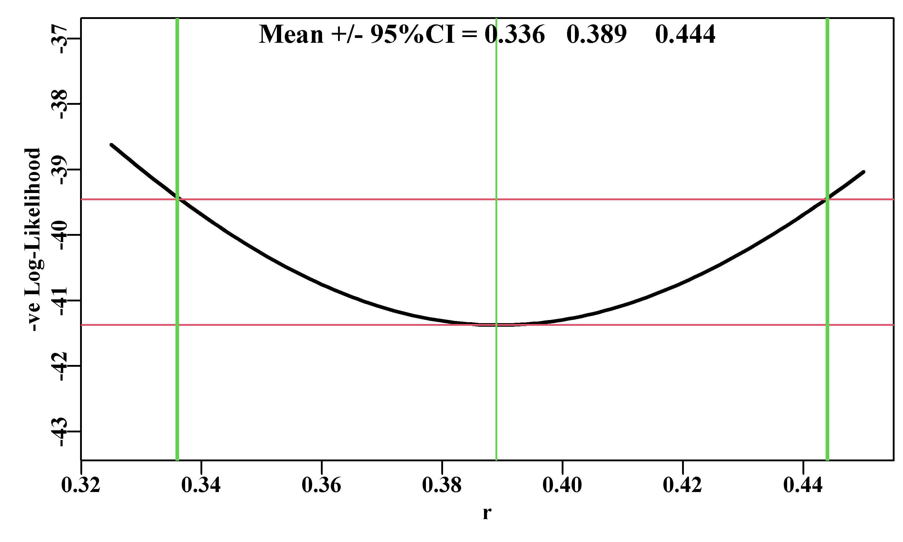
Figure 6.10: A likelihood profile for the r parameter from the Schaefer surplus production model fitted to the abdat data set. The horizontal solid lines are the minimum and the minimum minus 1.92 (95% level for \(\chi^2\) with 1 degree of freedom, see text). The outer vertical lines are the approximate 95% confidence bounds around the central mean of 0.389.
We can repeat this analysis for the other parameters in the Schaefer model. For example, we can look at the \(K\) parameter in a similar way using almost identical code. Note the stronger asymmetry in the profile plot for \(K\). There is slight asymmetry in the likelihood profile for \(r\) (subtract the 95% CI from the mean estimate), but visually it is obvious with the \(K\) parameter. The optimum parameter estimate for \(K\) is 9128.5, but the maximum likelihood in the profile data, points to a value of 9130. This is merely a reflection of the step length of the likelihood profile. It is currently set to 10, if it is set to 1 then we can obtain a closer approximation, although, of course, the analysis would take 10 times as long to run.
 #Likelihood profile for K values 7200 to 12000
Kval <- seq(7200,12000,10)
ntrial <- length(Kval)
columns <- c("r","K","Binit","sigma","-veLL")
resultK <- matrix(0,nrow=ntrial,ncol=length(columns),
                 dimnames=list(Kval,columns))
bestest <- c(r= 0.45,K=7500,Binit=2800,sigma=0.05)
for (i in 1:ntrial) {
  param <- log(c(bestest[1],Kval[i],bestest[c(3,4)]))
  parinit <- param
  bestmodP <- nlm(f=negLLP,p=param,funk=simpspm,initpar=parinit,
                indat=abdat,logobs=log(abdat$cpue),
                notfixed=c(1,3,4),iterlim=1000)
  bestest <- exp(bestmodP$estimate)
  resultK[i,] <- c(bestest,bestmodP$minimum)
}
minLLK <- min(resultK[,"-veLL"])
#kable(head(result,12),digits=c(4,3,3,4,5)) # if wanted. 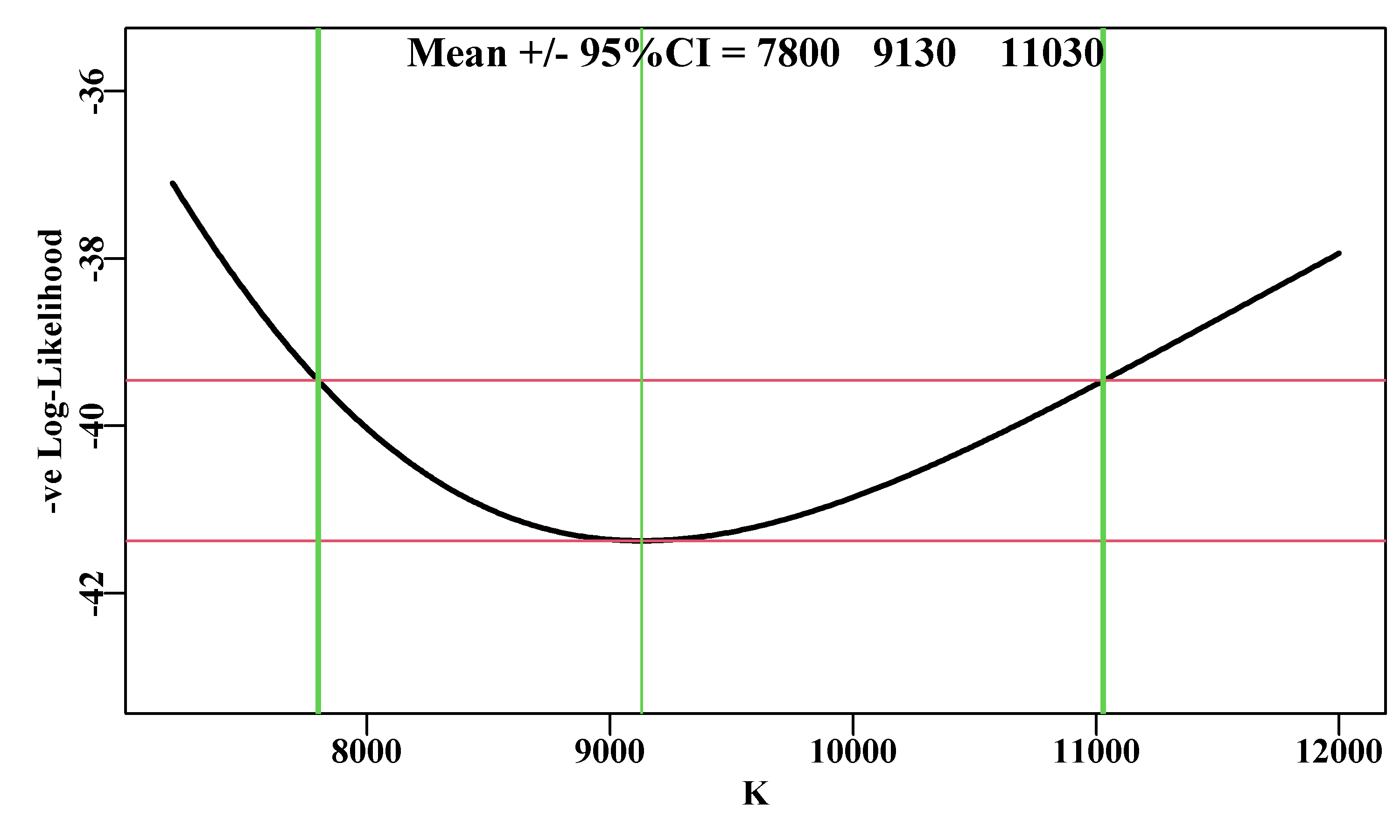
Figure 6.11: A likelihood profile for the K parameter from the Schaefer surplus production model fitted to the abdat data-set, conducted in the same manner as the r parameter. The red lines are the minimum and the minimum plus 1.92 (95% level for Chi2 with 1 degree of freedom, see text). The vertical thick lines are the approximate 95% confidence bounds around the mean of 9128.5.
6.6.2 -ve Log-Likelihoods or Likelihoods
We have plotted the -ve Log-Likelihoods, e.g. Figure(6.11), and these are fine when operating in log-space, but few people have clear intuitions about log-space. An alternative, with which it may be simpler to understand the principle behind the percentile confidence intervals, would be to back-transform the -ve log-likelihoods into simple likelihoods. Of course, a log value of -41 denotes a very small number when back-transformed, but we can re-scale those values in the process of ensuring that the values of all the likelihoods sum to 1.0. To back-transform the negative log-likelihoods we need to negate them and then exponent them.
\[\begin{equation} L = exp(-(-veLL )) \tag{6.16} \end{equation}\]
So, for the likelihood profile applied to the K parameter we can see that the linear-space likelihoods begin to increase as the value of \(K\) approaches the optimum, and if we plot those likelihoods the shape of the distribution can be seen to take on a shape more intuitively understandable. The tails stay above zero but are well away from the 95% intervals:
 #translate -velog-likelihoods into likelihoods
likes <- exp(-resultK[,"-veLL"])/sum(exp(-resultK[,"-veLL"]),
                                     na.rm=TRUE)
resK <- cbind(resultK,likes,cumlike=cumsum(likes)) | r | K | Binit | sigma | -veLL | likes | cumlike | |
|---|---|---|---|---|---|---|---|
| 7200 | 0.4731 | 7200 | 2689.875 | 0.0516 | -37.09799 | 6.8863e-05 | 0.0000689 |
| 7210 | 0.4726 | 7210 | 2693.444 | 0.0515 | -37.14518 | 7.2191e-05 | 0.0001411 |
| 7220 | 0.4720 | 7220 | 2697.023 | 0.0514 | -37.19213 | 7.5660e-05 | 0.0002167 |
| 7230 | 0.4714 | 7230 | 2700.602 | 0.0513 | -37.23881 | 7.9276e-05 | 0.0002960 |
| 7240 | 0.4709 | 7240 | 2704.182 | 0.0512 | -37.28524 | 8.3044e-05 | 0.0003790 |
| 7250 | 0.4703 | 7250 | 2707.762 | 0.0511 | -37.33141 | 8.6968e-05 | 0.0004660 |
| 7260 | 0.4698 | 7260 | 2711.341 | 0.0510 | -37.37732 | 9.1054e-05 | 0.0005571 |
| 7270 | 0.4692 | 7270 | 2714.921 | 0.0509 | -37.42298 | 9.5307e-05 | 0.0006524 |
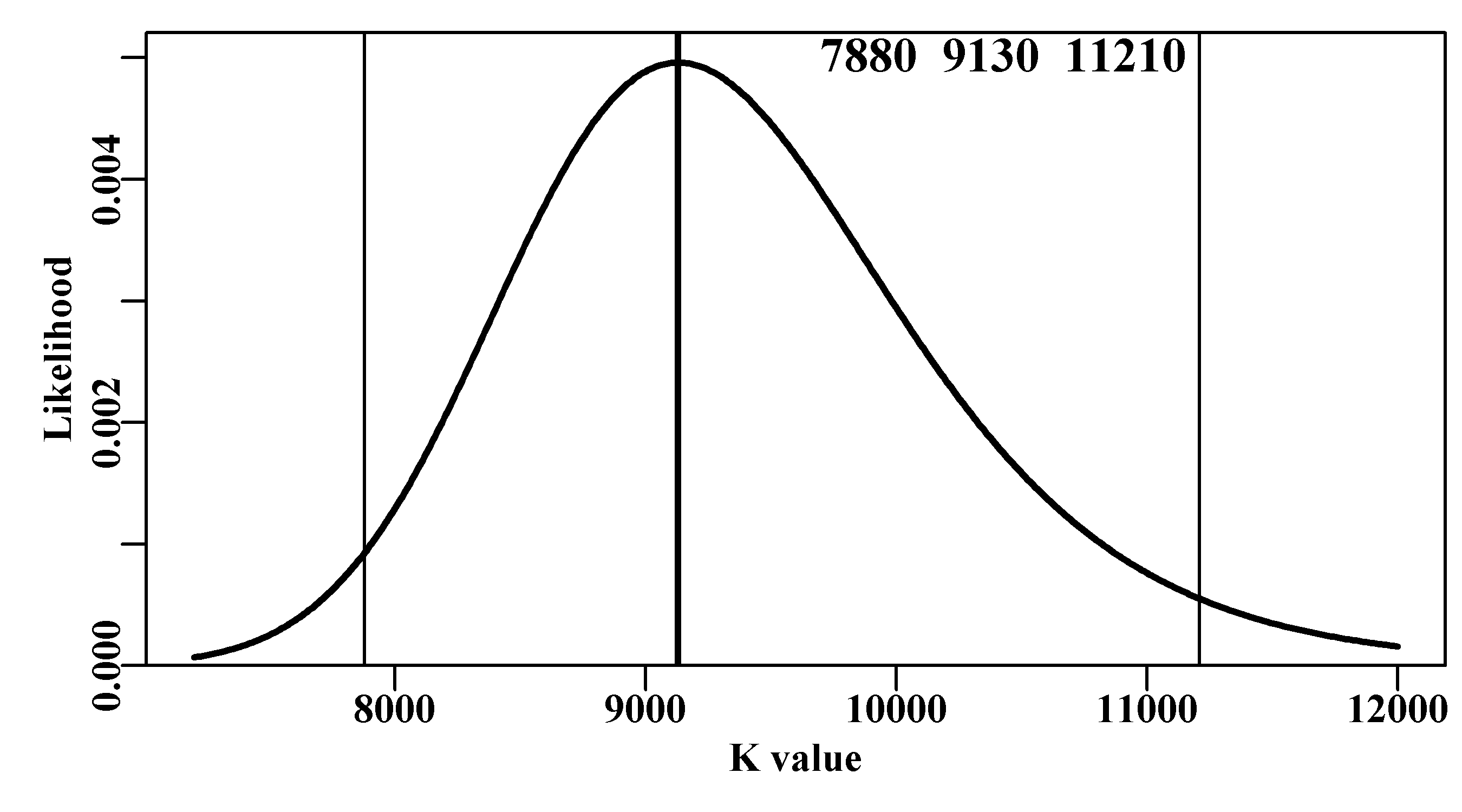
Figure 6.12: A likelihood profile for the K parameter from the Schaefer surplus production model fitted to the abdat data-set. In this case the -ve log-likelihoods have been back-transformed to likelihoods and scaled to sum to 1.0. The vertical lines are the approximate 95% confidence bounds around the mean. The top three numbers are the bounds and estimated optimum.
6.6.3 Percentile Likelihood Profiles for Model Outputs
Generally, the interest in stock assessment models relates to model outputs that are not directly estimated as parameters. As we have seen, generating confidence bounds around parameter estimates is relatively straightforward, but how do we provide similar estimates of uncertainty about model outputs such as the MSY (for the Schaefer model \(MSY = rK/4\))? For example, an assessment model might estimate stock biomass, or the maximum sustainable yield, or some other performance measure that can be considered an indirect output from a model. Likelihood profiles for such model outputs can be produced by adding a penalty term to the negative log-likelihood that attempts to constrain the likelihood to the optimal target (see Equ(6.17)). In this way, the impact on the log-likelihood of moving away from the optimum can be characterized.
\[\begin{equation} -veLL = -veLL-w \left(\frac{output-target}{target} \right)^2 \tag{6.17} \end{equation}\]
where -veLL is the negative log-likelihood, output is the variable of interest (in the example to follow this is the MSY), target is the optimum for that variable (the MSY from the overall optimal solution), and \(w\) is a weighting factor. The weighting factor should be as large as possible to generate the narrowest likelihood profile while still being able to converge on a solution. Below, we describe a specialized function negLLO() to deal with likelihood profiles around model outputs (this is not in MQMF). It is simply a modified version of the negLL() function that allow for the introduction of the weighting factor described in Equ(6.17). We can illustrate this by examining the likelihood profile around the optimum MSY value of 887.729t, which can be done across a range of 740 - 1050 tonnes, with a weighting of 900.
 #examine effect on -veLL of MSY values from 740 - 1050t
 #need a different negLLP() function, negLLO(): O for output.
 #now optvar=888.831 (rK/4), the optimum MSY, varval ranges 740-1050
 #and wght is the weighting to give to the penalty
negLLO <- function(pars,funk,indat,logobs,wght,optvar,varval) {
  logpred <- funk(pars,indat)
  LL <- -sum(dnorm(logobs,logpred,exp(tail(pars,1)),log=T)) +
             wght*((varval - optvar)/optvar)^2  #compare with negLL
  return(LL)
} # end of negLLO
msyP <- seq(740,1020,2.5);
optmsy <- exp(optmod$estimate[1])*exp(optmod$estimate[2])/4
ntrial <- length(msyP)
wait <- 400
columns <- c("r","K","Binit","sigma","-veLL","MSY","pen",
             "TrialMSY")
resultO <- matrix(0,nrow=ntrial,ncol=length(columns),
                  dimnames=list(msyP,columns))
bestest <- c(r= 0.47,K=7300,Binit=2700,sigma=0.05)
for (i in 1:ntrial) {  # i <- 1
  param <- log(bestest)
  bestmodO <- nlm(f=negLLO,p=param,funk=simpspm,indat=abdat,
                  logobs=log(abdat$cpue),wght=wait,
                  optvar=optmsy,varval=msyP[i],iterlim=1000)
  bestest <- exp(bestmodO$estimate)
  ans <- c(bestest,bestmodO$minimum,bestest[1]*bestest[2]/4,
           wait *((msyP[i] - optmsy)/optmsy)^2,msyP[i])
  resultO[i,] <- ans
}
minLLO <- min(resultO[,"-veLL"]) | r | K | Binit | sigma | -veLL | MSY | pen | |
|---|---|---|---|---|---|---|---|
| 740 | 0.389 | 9130.914 | 3385.871 | 0.0432 | -30.16 | 888.883 | 11.22 |
| 742.5 | 0.389 | 9130.911 | 3385.872 | 0.0432 | -30.53 | 888.883 | 10.84 |
| 745 | 0.389 | 9130.911 | 3385.872 | 0.0432 | -30.90 | 888.883 | 10.47 |
| 747.5 | 0.389 | 9130.911 | 3385.872 | 0.0432 | -31.26 | 888.883 | 10.11 |
| r | K | Binit | sigma | -veLL | MSY | pen | |
|---|---|---|---|---|---|---|---|
| 1012.5 | 0.389 | 9130.911 | 3385.872 | 0.0432 | -33.63 | 888.883 | 7.74 |
| 1015 | 0.389 | 9130.911 | 3385.872 | 0.0432 | -33.32 | 888.883 | 8.06 |
| 1017.5 | 0.389 | 9130.911 | 3385.872 | 0.0432 | -32.99 | 888.883 | 8.38 |
| 1020 | 0.389 | 9130.911 | 3385.872 | 0.0432 | -32.66 | 888.883 | 8.71 |
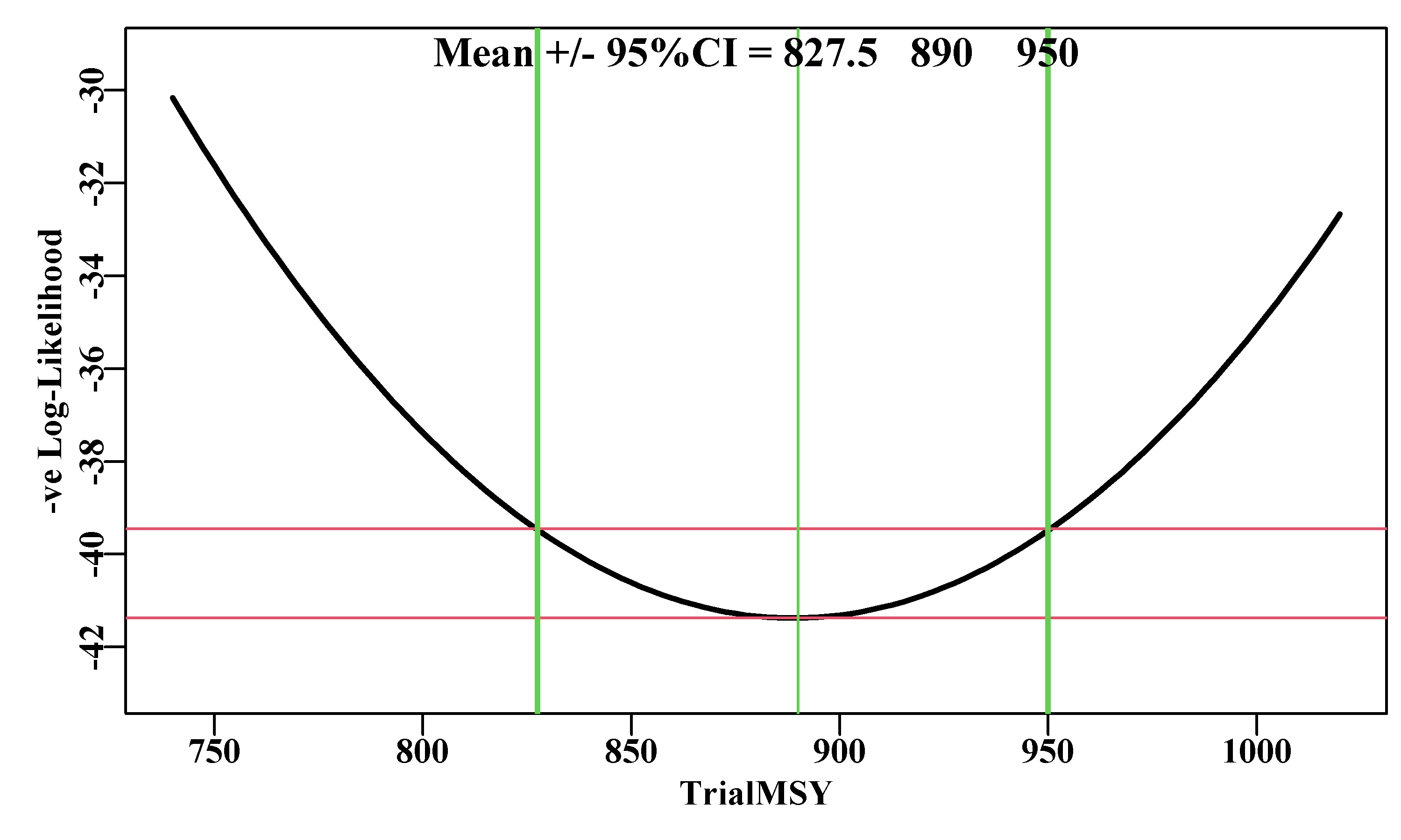
Figure 6.13: A likelihood profile for the MSY implied by the Schaefer surplus production model fitted to the abdat data-set. The horizontal red lines are the minimum and the minimum plus 1.92 (95% level for Chi2 with 1 degree of freedom, see text). The vertical lines are the approximate 95% confidence bounds around the mean of 887.729t.
Unfortunately, determining the optimum weighting to apply to the penalty term inside what we have termed negLLO(), can only be done empirically (trial and error). I recommended using a weight of 900 because I had already found that at that level the 95% CI stabilized. But it took my trying from 100 up to 700 in steps of 100, and then using steps of 50 to discover this. You should try using weight values of 500, 700, 800, 900 and 950, to see the convergence to stable values. The suggestion of the largest value that will still permit stable solutions remains vague guidance. This makes this approach perhaps the trickiest to apply in a repeatable manner. If you were to try the analysis above using a wght = 400, then the 95% CI become 825 - 950, rather than 847.5 - 927.5. In such cases there is no deterministic solution so it becomes a case of trying different weights and searching for a solution that is repeatable and consistent.
The 95% CI obtained using this likelihood profile approach are comparable to those from using a bootstrap (856.7 - 927.5) and from using asymptotic errors (849.7 - 927.4). Each of these methods could generate somewhat different answers as a function of the sample size selected. Nevertheless, the consistency between methods suggests they each generate a reasonable characterization of the variation inherent in the combination of this model and this data.
6.7 Bayesian Posterior Distributions
Fitting model parameters to observed data can be likened to searching for the location of the maximum likelihood on a multi-dimensional likelihood surface implied by a model and a given data set. If the likelihood surface is very steep in the vicinity of the optimum, then the uncertainty associated with those parameters would be relatively small. Conversely, if the likelihood surface was comparatively flat near the optimum, this would imply that similar likelihoods could be obtained from rather different parameter values, and the uncertainty around those parameters and any related model outputs would therefore be expected to be relatively high. Similar arguments can be made if there is strong parameter correlations. We are ignoring the complexities of dealing with highly multi-dimensional parameter spaces in more complex models because the geometrical concepts of steepness and surface still apply to multi-dimensional likelihoods.
As we have seen, if we assume that the likelihood surface is multi-variate normal in the vicinity of the optimum, then we can use asymptotic standard errors to define confidence intervals around parameter estimates. However, for many variables and model outputs in fisheries that might be a very strong assumption. The estimated likelihood profile for the Schaefer \(K\) parameter was, for example, relatively skewed, Figure6.12. Ideally, we would use methods that characterized the likelihood surface in the vicinity of the optimum solution independently of any predetermined probability density function. If we could manage that, we could use the equivalent of percentile methods to provide estimates of the confidence intervals around parameters and model outputs.
With formal likelihood profiles we can conduct a search across the parameter space to produce a 2-dimensional likelihood surface. However, formal likelihood profiles for more than two parameters, perhaps using such a grid search, would be very clumsy and more and more impractical as the number of parameters increased further. What is needed is a method of integrating across many dimensions at once to generate something akin to a multi-dimensional likelihood profile. In fact, there are a number of ways of doing this, including Sampling Importance Sampling (SIR; see McAllister and Ianelli, 1997; and McAllister et al, 1994), and Markov Chain Monte Carlo (MCMC ; see Gelman et al 2013). In the examples to follow we will implement the MCMC methodology. There are numerous alternative algorithms for conducting an MCMC, but we will focus on a relatively flexible approach called the Gibbs-within-Metropolis sampler (or sometimes Metropolis-Hastings-within-Gibbs). The Metropolis algorithm (Metropolis et al, 1953), which started as two-dimensional integration, was generalized by Hastings (1970), hence Metropolis-Hastings. In the literature you will find reference to the Markov Chain Monte Carlo but also the Monte Carlo Markov Chain. The former is used by the standard reference used in fisheries (Gelman et al, 2013) although personally I find the idea of a Monte Carlo approach to generating a Markov Chain more intuitively obvious. Despite this potential confusion I would suggest sticking with MCMC when writing and if necessary ignore my intuitions and use Markov Chain Monte Carlo. Such things are not sufficiently important to spend time worrying about, except sometimes the differences can actually mean something (such confusions remain a problem, but as long as you are aware of such pitfalls you can avoid them!).
An MCMC, obviously, uses a Markov chain to trace over the multi-dimensional likelihood surface. A Markov chain describes a process whereby each state is determined probabilistically from the previous state. A random walk would constitute one form of Markov chain, and its final state would be a description of a random distribution. However, the aim here is to produce a Markov chain whose final equilibrium state, the so-called stationary distribution, provides a description of the target or posterior distribution of Bayesian statistics.
The Markov chain starts with some combination of parameter values, the available observed data, and the model being used, and these together define a location in the likelihood space. Depending on the set of parameter values, the likelihood can obviously be small or large (with an upper limit of the model’s maximum likelihood ). The MCMC process entails iteratively stepping through the parameter space following a set of rules based on the likelihood of each new candidate parameter set relative to the previous set, to determine which steps will become part of the Markov chain. The decision being made each iteration is which parameter vectors will be accepted and which rejected? Each step of the process entails the production of a new candidate set of parameter values, which is done stochastically (hence Markov Chain Monte Carlo) and, in the Gibbs-within-Metropolis, one parameter at a time (Casella and George, 1992; Millar and Meyer, 2000). Each of these new candidate sets of parameters, combined with the available data and the model, defines a new likelihood. Whether this new parameter combination is accepted as the next step in the Markov chain depends on how much the likelihood has been changed. In all cases where the likelihood increases the step is accepted, which seems reasonable. Now comes the important part, where the likelihood decreases it can still be accepted if the ratio of the new likelihood relative to the old likelihood is larger than some uniform random number (between 0 and 1; see the equations below).
There is a further constraint that relates to parameter correlations and the fact that the Monte Carlo process is likely to lead to auto-correlation between sequential parameter sets. If there is significant serial correlation among parameter sets this can generate biased conclusions about the full extent of variation across the parameter space. The solution used is to thin out the resulting chain so that the final Markov chain will contain only every \(n^{th}\) point. The trick is to select this thinning rate so that the serial correlation between the \(n^{th}\) parameter vectors is sufficiently small that it no longer influences the overall variance. Among other things we will explore this thinning rate in the practical examples.
6.7.1 Generating the Markov Chain
A Markov chain can be generated if the likelihood of an initial set of a specific model’s parameters \(\theta_{t}\), can be defined given a set of data \(x\), and the Bayesian prior probability of the parameter set, \(L(\theta_t)\):
\[\begin{equation} L_t=L(\theta_t | x) \times L(\theta_t) \tag{6.18} \end{equation}\]
We can then generate a new trial or candidate (\(C\)) parameter set \(\theta^C\) by randomly incrementing at least one of the parameters in \({\theta^C} = {\theta_{t}} + \Delta{\theta_t}\), which will alter the implied likelihood:
\[\begin{equation} L^C = L(\theta^C | x) \times L(\theta_t) \tag{6.19} \end{equation}\]
If the ratio of \(L^C\) and \(L_t\) is greater than 1, then the jump from \(\theta_t\) to \(\theta^C\) is accepted into the Markov chain (\(\theta_{t+1} = \theta^C\)).
\[\begin{equation} r = \frac{L^C}{L_t} = \frac{L \left (\theta^C | x \right ) \times L(\theta_t)}{L \left (\theta_t | x\right ) \times L(\theta_t)} > 1.0 \tag{6.20} \end{equation}\]
Alternatively, if the ratio (\(r\)) is less than 1, then the jump is only accepted, if the ratio \(r\) is greater than a newly selected uniform random number. If it is not accepted then \(\theta_{t+1}\) reverts to \(\theta_t\) and a new candidate cycle is begun:
\[\begin{equation} {{\theta }_{t+1}}=\left\{ \begin{matrix} {{\theta }^{C}} & if\left[ {L^C}/{L_t} > U\left( 0,1 \right) \right] \\ {{\theta }_{t}} & otherwise \end{matrix} \right. \tag{6.21} \end{equation}\]
In fact, because the maximum random uniform number between 0 and 1 is 1 then Equ(6.20) is not strictly necessary. We could just estimate the ratio and use Equ(6.21) (this is how it is implemented in the function do_MCMC()). If the candidate parameter vector is rejected, it reverts to the original and the cycle starts again with a new candidate parameter set. As the Markov chain develops it should trace out a multidimensional volume in parameter space. After sufficient iterations it should converge on the stationary distribution. After some expansion on some of these theoretical details we will go through some worked examples to illustrate all of these ideas.
6.7.2 The Starting Point
Starting off the Markov Chain simply entails selecting a vector of parameters. One solution is to select a vector close to but not identical to the maximum likelihood optimum solution. Gelman and Rubin (1992) recommend using a sample from an over-dispersed distribution akin to the expected distribution, but that assumes one has an idea of what over-dispersed distribution one should use to start with, and choosing this remains something of an art form (Racine-Poon, 1992). As further stated by Racine-Poon (1992): “However, the target distributions are often multi-modal, especially for high-dimensional problems, and I am not too confident about automating the process.” However, the starting points used can be influential on the outcome so Gelman and Rubin (1992) recommend starting multiple chains from very different starting points (rather than just one very long chain; Geyer, 1992) and then ensure they all converge on the same final distribution. All these recommendations arose in the early 1990s when computers were much slower than now, so the discussion that occurred over multiple chains or very long single chains (see, for example, much of Volume 7(4) of Statistical Science) is no longer such an issue and there is no real reason not to run multiple very long chains (though it would still be sensible to use the most efficient software as MCMCs invariably require a large investment of time).
6.7.3 The Burn-in Period
An important point that relates to starting off the Markov chain(s) at points possibly some way from the multi-dimensional mode of the posterior distribution, is that the first series of points generated are expected to make their stochastic way towards the region of higher likelihoods. However, these early points may add a clumsy and inappropriate tail to what ought to be the final cloud of acceptable parameter vectors. Thus, the standard practice is simply to delete the first \(m\) points where \(m\) is known as the burn-in period. Gelman et al (2013) recommend deleting up to the first half (50%) of each chain as a burn-in period, but at that point in their book they are discussing chains that are only 100’s of steps long, so, in fisheries, when dealing with much higher dimensional problems, we need not be so drastic. A few hundred early points or even less may often be sufficient, especially if one starts not too far from the maximum likelihood estimate. But initial exploration of the types of chain one might generate should enable a reasonable burn-in period to be found for each problem.
6.7.4 Convergence to the Stationary Distribution
The discussion in the 1990s concerning how many chains and how long they should be was driven by the need to demonstrate that the generated Markov Chain had converged to a stable solution (the stationary distribution or posterior distribution, when dealing with Bayesian statistics). Both Gelman and Rubin (1992) and Geyer (1992) presented empirical methods for determining the evidence for convergence. These generally revolved around comparing the variance within chains with the variance between chains, or the variance in one part of a Markov Chain with another part of the same chain. A visual approach was simply to plot the marginal distributions of important parameters from multiple chains, or portions of a chain, on top of each other. If they matched sufficiently well one could assume that convergence had been achieved, though nobody seems to define exactly what would be classed as sufficient. Being empirical, all of these methods cannot guarantee that convergence is complete but, as yet, more analytical methods remain undiscovered. Here we will focus on multiple chains with simple comparative statistics mean, median, quantiles, and variance) and marginal distribution plots, but there are various such diagnostics (Geweke, 1989; Gelman and Rubin, 1992; Geyer, 1992). The R package coda also has implementations of many of the diagnostic tools and can import simple matrix outputs, such as we will generate, using a simple statement such as post = coda::mcmc(posterior). Here, however, we will continue to tabulate and plot in explicit R so the reader can easily see the mechanics. The problem of deciding whether to use an already excellent package, such as coda, or write custom plotting and tabulating functions oneself is something to decide for yourself, but only after you know how to write your own functions.
6.7.5 The Jumping Distribution
How each new candidate parameter vector is generated depends upon what is known as the jumping distribution. There are many options available to act as this jumping distribution but commonly, for each parameter in turn in the set \(\theta\), a standard normal random deviate \(N(0,1)\) is generated, and this is scaled, \(\alpha_i\), to suit the scale of the parameter, \(i\), being incremented, Equ(6.22). If there was information about parameter correlations, it would be possible to use a multi-variate normal distribution to generate a full new candidate parameter vector at each step; using a standard multi-variate normal remains a possibility so that parameter correlations are ignored. However, incrementing each parameter in turn before applying the Metropolis-Hastings approach (Gibbs-within-Metropolis) seems intuitively simpler to understand (though not always the most efficient).
\[\begin{equation} \theta_{i}^C = \theta_{t,i} + N(0,1) \times \alpha_i \tag{6.22} \end{equation}\]
The scaling by \(\alpha_i\) as the procedure cycles through each of the parameters in \(\theta\), is important because if the jumps in parameter space are too large, then the success rate of the jumps may be very low, but if they are too small, the success rate may be too high and it may take an enormous number of iterations, and time, to fully explore the multi-dimensional likelihood surface and converge on a stationary distribution. There is an element of trial and error in this procedure with no fixed or simple rule as to what scaling factor to use. The acceptance rate of the new candidate values is an indicator of the efficiency of the performance. A simple rule-of-thumb might be to scale the normal random deviate to approximate between 0.5% and 1.0% of the original parameter value. An acceptance rate of 0.2 to 0.4 (20 - 40 %) might be a reasonable target to aim for when adjusting the increments to the parameter set. The scaling values \(\alpha_i\) will generally differ between parameters and when developing a new analysis may require some detailed searching for some acceptable values. It is possible to build such adaptive searching into the code used to run an MCMC. Generally, when conducting an MCMC analysis one would use software customized for executing such analyses. For example, Gelman et al (2013) have an appendix entitled Example of computation in R and Bugs, but now the recommendation is to use software named Stan rather than Bugs (see https://mc-stan.org/, where there is ample documentation). However, here, so as to ensure the exposition remains transparent with no black boxes, we will keep things purely within R while emphasizing that such analyses require a degree of customization to suit each case.
If one uses a multi-variate normal to increment all parameters at once then the scaling factors will become smaller than when increment single parameters, and the reduction is related to the number of parameters being varied at once.
6.7.6 Application of MCMC to the Example
Once again we will use the abdat data with the Schaefer surplus production model fit as the example explored to illustrate the methods. With more complex models (more parameters) the time to conduct the analyses can expand greatly but the same underlying principles apply.
 #activate and plot the fisheries data in abdat  Fig 6.14
data(abdat)   # type abdat in the console to see contents
plotspmdat(abdat) #use helper function to plot fishery stats vs year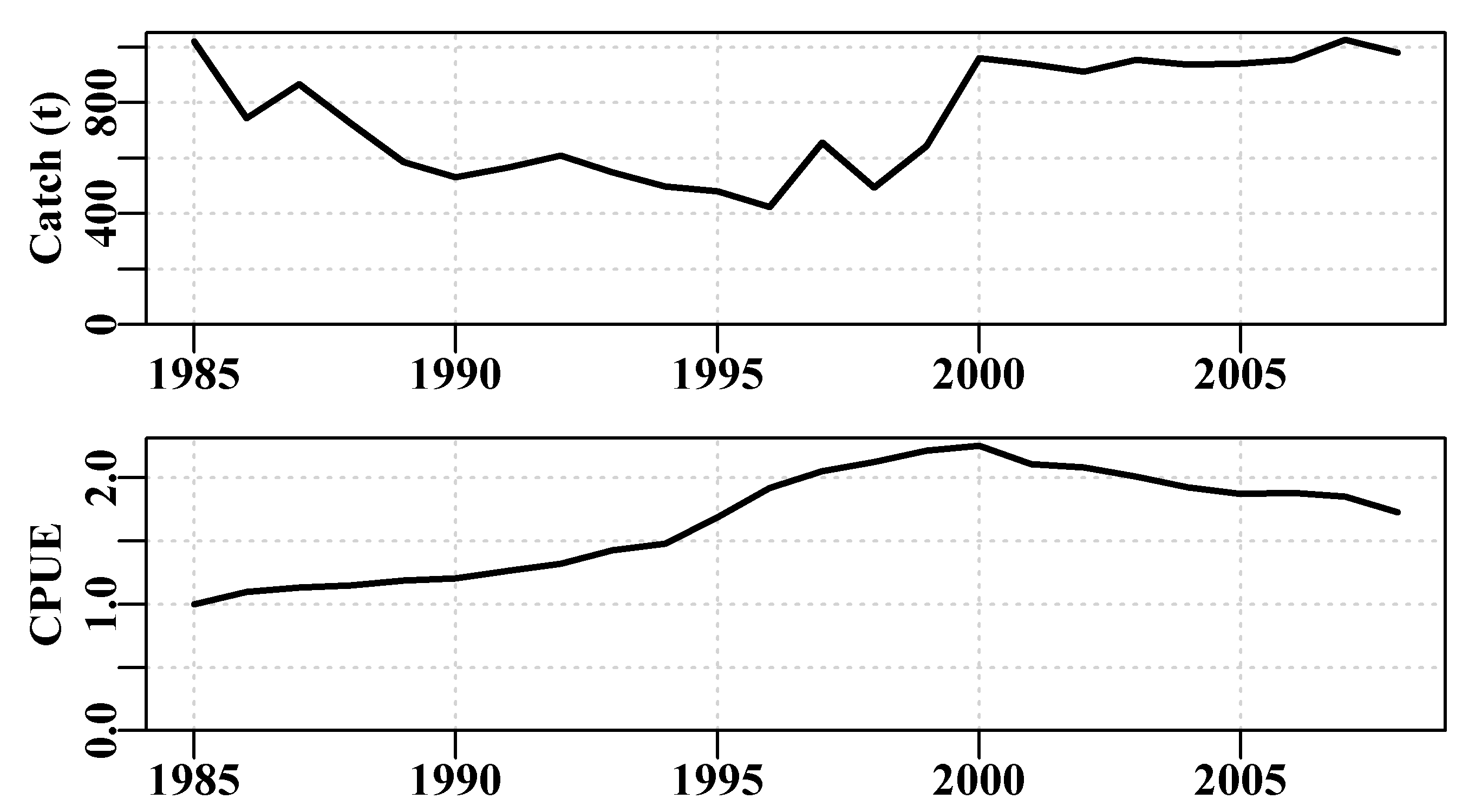
Figure 6.14: The time-series of cpue and catch from the abdat data set.
6.7.7 Markov Chain Monte Carlo
The equations describing the Gibbs-within-Metropolis appear relatively straightforward and even simple. However, their implementation involves quite a few more details. As we saw in the chapter on Model Parameter Estimation when calculating Bayesian statistics we need a method for calculating the likelihood of a set of parameters, but we also need a method for calculating their prior probability (even where we attribute a non-informative prior to the analysis). There are a number of other pre-requisites needed to implement the MCMC :
the functions required to calculate the negative log-likelihood and the prior probability of each candidate parameter set
with what parameter set are we going to start the MCMC process, and how long should we run the MCMC process before we start storing the accepted parameter vectors (how big a burn-in)?
how often in the process should we consider accepting a result (thinning rate)?
how many independent Markov Chains we are going to generate, and how long should the chains we intend to generate be before we stop the MCMC process?
how does one select an appropriate set of weightings (the \(\alpha_i\)) in a given situation?
Answering these requirements and questions in sequence:
The function used to calculate the negative log-likelihood remains negLL() although, because we are exploring the parameter space, to avoid allowing \(r\) to fall below zero one should perhaps use negLL1(), which places a penalty on the first parameter in the vector if it approaches zero (examine negLL1()’s help and code). Here we will always be assuming non-informative priors for each parameter so we have included a function calcprior() into MQMF which merely sums the the log of the reciprocal of the length of each chain. That is, it ascribes an equal likelihood to each possible parameter value for all parameters. Thus the individual likelihoods are \(1/N\), where \(N\) is the predetermined length of each chain, including the burn-in length. We use their log-transformed value as we are dealing with log-likelihoods in an effort to avoid rounding errors through dealing with tiny numbers. Should you have an analytical problem where it was desired to use an informative prior for all or some of the parameters one would only have to re-write calcprior(), which would then mask the version within MQMF, and the required result should follow.
It is standard practice to have what is termed a burn-in period where the MCMC process is run for a number of iterations from its starting point without storing the results. This rejection of early results is done to ensure that the Markov Chain has begun exploring the model’s likelihood surface rather than wandering around in very low likelihood space. This will, of course, depend upon what starting values one would be using to begin the Markov Chain. One could start the MCMC with the maximum likelihood solution but this is generally discouraged as potentially biasing the outcome. However, if one included a burn-in period of a few hundred steps the accepted starting point would have moved away from the optimum solution. Nevertheless, it is good practice to begin the Markov Chain candidate parameter vectors somewhat away from the optimum solution and, with multiple chains, to start each chain at a different point.
Looking at the equations for the Gibbs-within-Metropolis one might gain the impression that each step through the process of selecting a candidate parameter vector and testing it can lead to the Markov Chain being incremented. This might be the case if there were no parameter correlations or auto-correlation between successive draws. However, in an effort to avoid such auto-correlation between successive steps in the Markov Chain it is common to only consider a step for inclusion in the chain after a given number of iterations have passed. Such chain thinning is designed to break any levels of auto-correlation. We already know that the Schaefer parameters are strongly correlated and will use that knowledge as the basis for exploring what degree of chain thinning is required to remove such auto-correlation in the Markov Chain. A potential confusion is that with the Gibbs-within-Metropolis we need a thinning step for each parameter. Thus a desired thinning step of 4 would require do_MCMC() receiving 4 x 4 = 16 as the thinstep argument.
The objective when generating a Markov Chain is that it should converge on the stationary distribution (the posterior distribution), which would provide a comprehensive characterization of the uncertainty of the subject model with its data. But how does one determine whether such convergence has been achieved. One approach is to generate more than one Markov Chain, starting from different origins. If they all converge so that the marginal distributions for each parameter are very similar across replicate chains this would be evidence of convergence. This could be visualized graphically. However, rather than only using graphical indicators, diagnostic statistics should be used to indicate whether convergence to a stationary distribution has occurred. There are many such statistics available, but here we will only mention some simple strategies. As with any nonlinear solver, it is a good idea to start the MCMC process from a wide range of initial values. Any diagnostic tests for identifying whether the MCMC has achieved the target stationary distribution would literally consider the convergence of the different Markov sequences.
Of course, it would be necessary to discard the so-called burn-in phase before making any comparisons. The burn-in phase is where the Markov chain may only be traversing sparse likelihood space before it starts to characterize the posterior distribution. Gelman et al (2013) recommend the conservative option of discarding the first half of each sequence, but the actual fraction selected should be determined by inspection. The simplest diagnostic statistics involve comparing the means and variances of either different sequences, or different portions of the same sequence. If the mean values from different sequences (or subsets of a sequence) are not significantly different, then the sequence(s) can be said to have converged. Similarly, if the within-sequence (or subset of a sequence) variance is not significantly different from the between-sequence, then convergence can be identified. Using a single sequence may appear convenient, but if convergence is relatively slow and this was unknown, then relying on a single sequence may provide incorrect answers. The title of Gelman and Rubin (1992a) states the problem clearly: “A single sequence from the Gibbs sampler gives a false sense of security.” Suffice to say that it is better to use multiple starting points to give multiple sequences along with an array of diagnostic statistics and graphics to ensure that the conclusions that one draws from any MCMC simulation are not spurious (Gelman et al, 2013). Such approaches are termed computer-intensive for a good reason. Determining how long a sequence to generate for each chain is also a question that only has an empirical answer. One needs to run the chains until convergence has occurred. This may happen quickly, or it may take a very long time. The more parameters in a model the longer this generally takes. Highly uncertain or unbalanced models may even fail to converge, which would be an inefficient methods of identifying such a problem.
The weightings given to the increments generated for each parameter are another thing that can only really be determined empirically. By developing criteria this process can be automated, and is often developed during a long burn-in phase, but here we will utilize trial and error and aim for an acceptance rate between 20 - 40 %.
6.7.8 A First Example of an MCMC
We will illustrate some of the ideas discussed above in our first example. To do that we will generate a Markov Chain of 10000 steps starting from close to the maximum likelihood solution but with a burn-in phase of 50 iterations (to move into the informative likelihood space), and a chain thinning rate of 4 steps (this will not avoid auto-correlation between successive points because a thinning each 4 steps with 4 parameters means no thinning, but more on that later). Using hindsight (because I ran this multiple times) I have set the \(\alpha_i\) to values that lead to acceptance rates between 20 - 40% of trials. Finally, we will also run three short chains of 100 iterations with no burn-in phase and different starting points to illustrate the effect of the burn-in and the use of different starting points. By using the set.seed() function we will also ensure that we obtain repeatable results (which would not usually be a sensible option).
Most of the work is done by the MQMF function do_MCMC(). You should examine the help and the code for this function and trace back where the equations describing the Gibbs-within-Metropolis are operating and how the prior probability is included you should also be able to see how the acceptance rate is calculated.
 # Conduct MCMC analysis to illustrate burn-in. Fig 6.15
data(abdat);  logce <- log(abdat$cpue)
fish <- as.matrix(abdat) # faster to use a matrix than a data.frame!
begin <- Sys.time()       # enable time taken to be calculated
chains <- 1                # 1 chain per run; normally do more
burnin <- 0                # no burn-in for first three chains
N <- 100                        # Number of MCMC steps to keep
step <- 4       # equals one step per parameter so no thinning
priorcalc <- calcprior # define the prior probability function
scales <- c(0.065,0.055,0.065,0.425) #found by trial and error
set.seed(128900) #gives repeatable results in book; usually omitted
inpar <- log(c(r= 0.4,K=11000,Binit=3600,sigma=0.05))
result1 <- do_MCMC(chains,burnin,N,step,inpar,negLL,calcpred=simpspm,
                   calcdat=fish,obsdat=logce,priorcalc,scales)
inpar <- log(c(r= 0.35,K=8500,Binit=3400,sigma=0.05))
result2 <- do_MCMC(chains,burnin,N,step,inpar,negLL,calcpred=simpspm,
                   calcdat=fish,obsdat=logce,priorcalc,scales)
inpar <- log(c(r= 0.45,K=9500,Binit=3200,sigma=0.05))
result3 <- do_MCMC(chains,burnin,N,step,inpar,negLL,calcpred=simpspm,
                   calcdat=fish,obsdat=logce,priorcalc,scales)
burnin <- 50 # strictly a low thinning rate of 4; not enough
step <- 16   # 16 thinstep rate = 4 parameters x 4 = 16
N <- 10000   # 16 x 10000 = 160,000 steps + 50 burnin
inpar <- log(c(r= 0.4,K=9400,Binit=3400,sigma=0.05))
result4 <- do_MCMC(chains,burnin,N,step,inpar,negLL,calcpred=simpspm,
                   calcdat=fish,obsdat=logce,priorcalc,scales)
post1 <- result1[[1]][[1]]
post2 <- result2[[1]][[1]]
post3 <- result3[[1]][[1]]
postY <- result4[[1]][[1]]
cat("time   = ",Sys.time() - begin,"\n")
cat("Accept = ",result4[[2]],"\n")
# time = 12.72281
# Accept = 0.3471241 0.3437158 0.354289 0.3826251Now we can plot out the 10000 long chain as a set of points and on top of those impose the three shorter chains for which no burn-in phase is used. This highlights the importance of the burn-in phase but also illustrates how different chains begin their exploration of the likelihood space independently (here only represented in two dimensions). If these three chains had been longer we would expect them to traverse a broader area within the space occupied by the grey dots.
 #first example and start of 3 initial chains for MCMC Fig6.15
parset(cex=0.85)
P <- 75  # the first 75 steps only start to explore parameter space
plot(postY[,"K"],postY[,"r"],type="p",cex=0.2,xlim=c(7000,13000),
   ylim=c(0.28,0.47),col=8,xlab="K",ylab="r",panel.first=grid())
lines(post2[1:P,"K"],post2[1:P,"r"],lwd=1,col=1)
points(post2[1:P,"K"],post2[1:P,"r"],pch=15,cex=1.0)
lines(post1[1:P,"K"],post1[1:P,"r"],lwd=1,col=1)
points(post1[1:P,"K"],post1[1:P,"r"],pch=1,cex=1.2,col=1)
lines(post3[1:P,"K"],post3[1:P,"r"],lwd=1,col=1)
points(post3[1:P,"K"],post3[1:P,"r"],pch=2,cex=1.2,col=1) 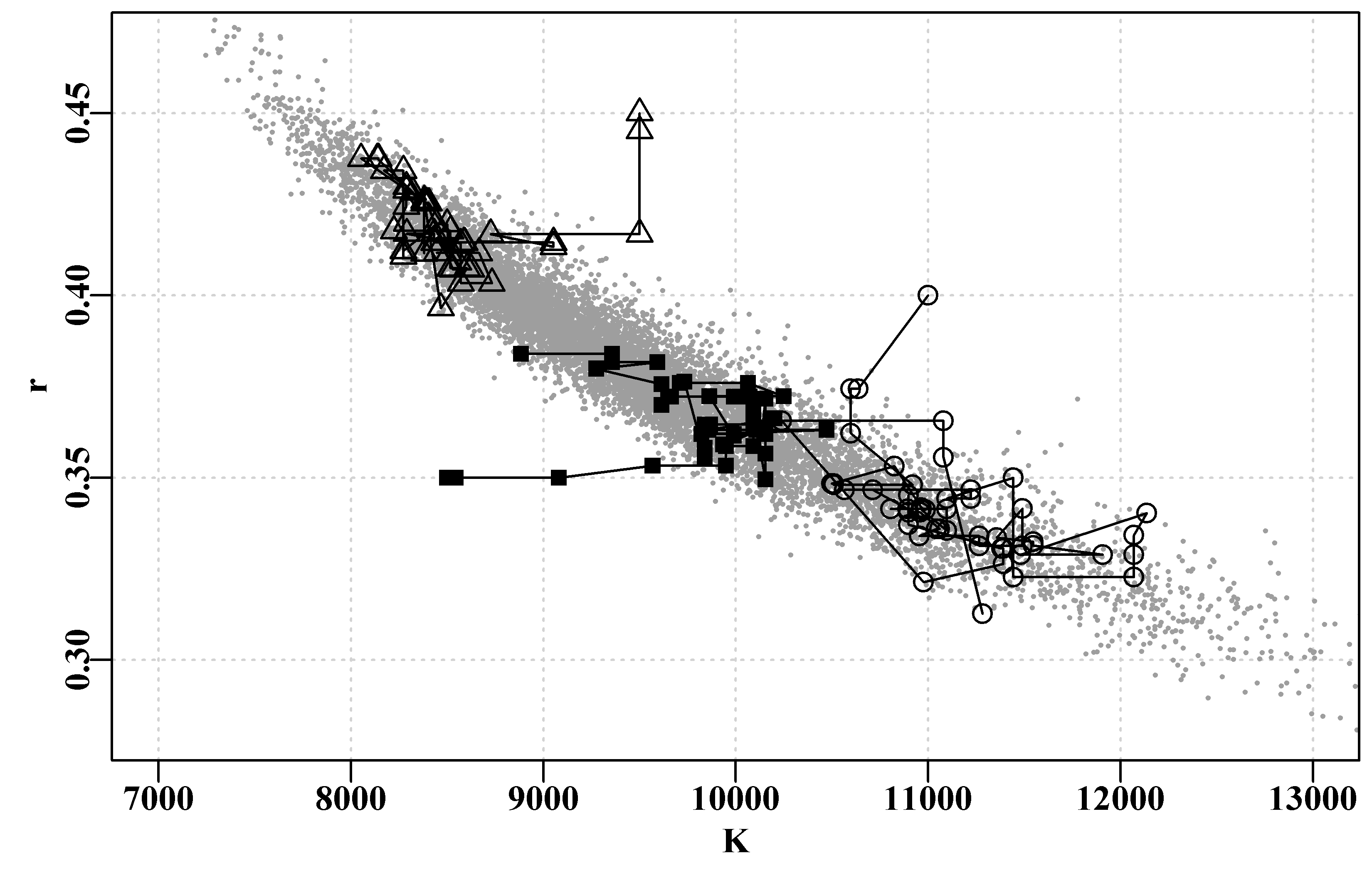
Figure 6.15: The first 75 points in three separate MCMC chains starting from different origins (triangles, squares, circles). No burn-in was set for these short chains so records begin from the starting points. The grey dots are 10000 points from a single fourth chain, with a 50 point burn-in and a thinning rate of four, giving an approximate idea of the stationary distribution towards which all chains should converge.
We can also examine details of the parameter correlation through plotting each parameter against the other using the pairs() function and the rgb() function to shade the colouring, this enables us to visualize the softer tail of points towards the larger values of \(K\) and smaller values of \(r\). To see the effect change the \(alpha\) argument (the 1/50) to 1/1, using a divisor of 50 appears to be a reasonable compromise for illustrating the gradient of density in this case (of 10000 points).
 #pairs plot of parameters from the first MCMC Fig 6.16
posterior <- result4[[1]][[1]]
msy <-posterior[,1]*posterior[,2]/4
pairs(cbind(posterior[,1:4],msy),pch=16,col=rgb(1,0,0,1/50),font=7) 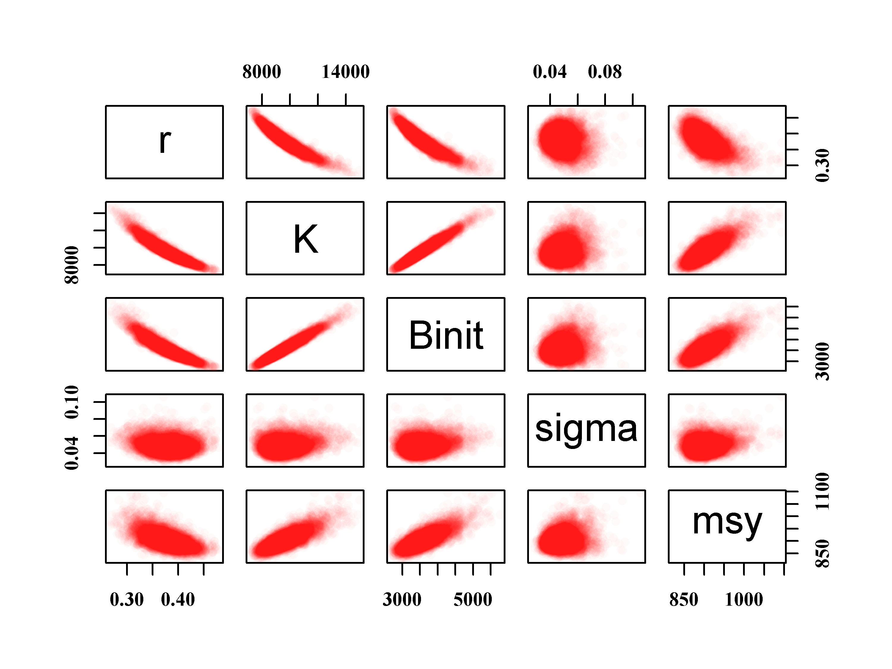
Figure 6.16: The relationship between the 10000 samples from the posterior distributions of the Schaefer model parameters and MSY. Normally one would use a much longer thinning step than 4 to characterize the posterior. Full colour in the plot comes from at least 50 points.
The accepted parameter vectors that make up the posterior distribution can each be plotted individually against the replicate number to provide a trace of each parameter. The ideal is to obtain what is commonly called a ‘hairy caterpillar’, which is especially evident in the trace for the \(\sigma\) parameter in Figure(6.17). The other traces, with their spikes up and down are suggestive of a degree of auto-correlation within each trace. This is also suggested by the complementary patterns of variation apparent in the \(r\) and \(K\) parameter traces. The marginal distributions provide an initial examination of the shape of the empirical distribution of each parameter. It is quite possible to have more than one mode or a flatter top depending on the data one has. However, an irregular shape suggests a lack of convergence.
 #plot the traces from the first MCMC example Fig 6.17
posterior <- result4[[1]][[1]]
par(mfrow=c(4,2),mai=c(0.4,0.4,0.05,0.05),oma=c(0.0,0,0.0,0.0))
par(cex=0.8, mgp=c(1.35,0.35,0), font.axis=7,font=7,font.lab=7)
label <- colnames(posterior)
N <- dim(posterior)[1]
for (i in 1:4) {
  ymax <- getmax(posterior[,i]); ymin <- getmin(posterior[,i])
  plot(1:N,posterior[,i],type="l",lwd=1,ylim=c(ymin,ymax),
       panel.first=grid(),ylab=label[i],xlab="Step")
  plot(density(posterior[,i]),lwd=2,col=2,panel.first=grid(),main="")
} 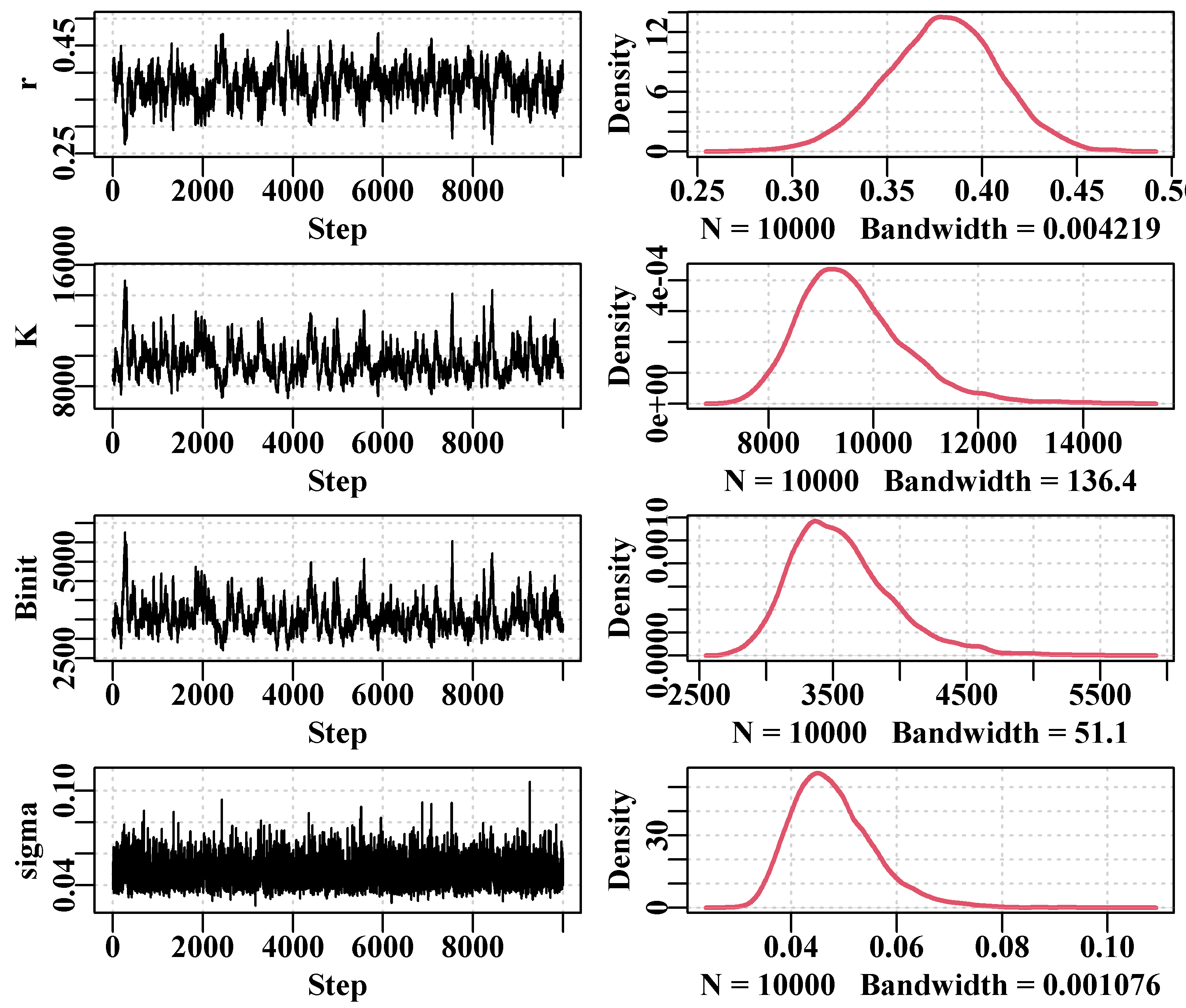
Figure 6.17: The traces for the four Schaefer model parameters along with the implied marginal distribution of each parameter. The obvious auto-correlation within traces should be improved if the thinning step were increased to 128, 256, or, as we shall see, much longer.
We can examine the degree of any auto-correlation among sequential steps in the Markov Chain by using the R function acf(). This correlates the values in a vector with itself, then with a lag of 1, then a lag of 2, and so on. One expects a correlation of 1 with a lag of 0, but, ideally, the correlation between sequential terms in the Markov Chain should drop to insignificance very quickly if we are to avoid under-representing the total variation. Compare the auto-correlogram for each parameter with its trace and marginal distribution. The visual difference between \(sigma\), with relatively low serial correlation, and the other parameters, should be apparent.
 #Use acf to examine auto-correlation with thinstep = 16   Fig 6.18
posterior <- result4[[1]][[1]]
label <- colnames(posterior)[1:4]
parset(plots=c(2,2),cex=0.85)
for (i in 1:4) auto <- acf(posterior[,i],type="correlation",lwd=2,
plot=TRUE,ylab=label[i],lag.max=20) 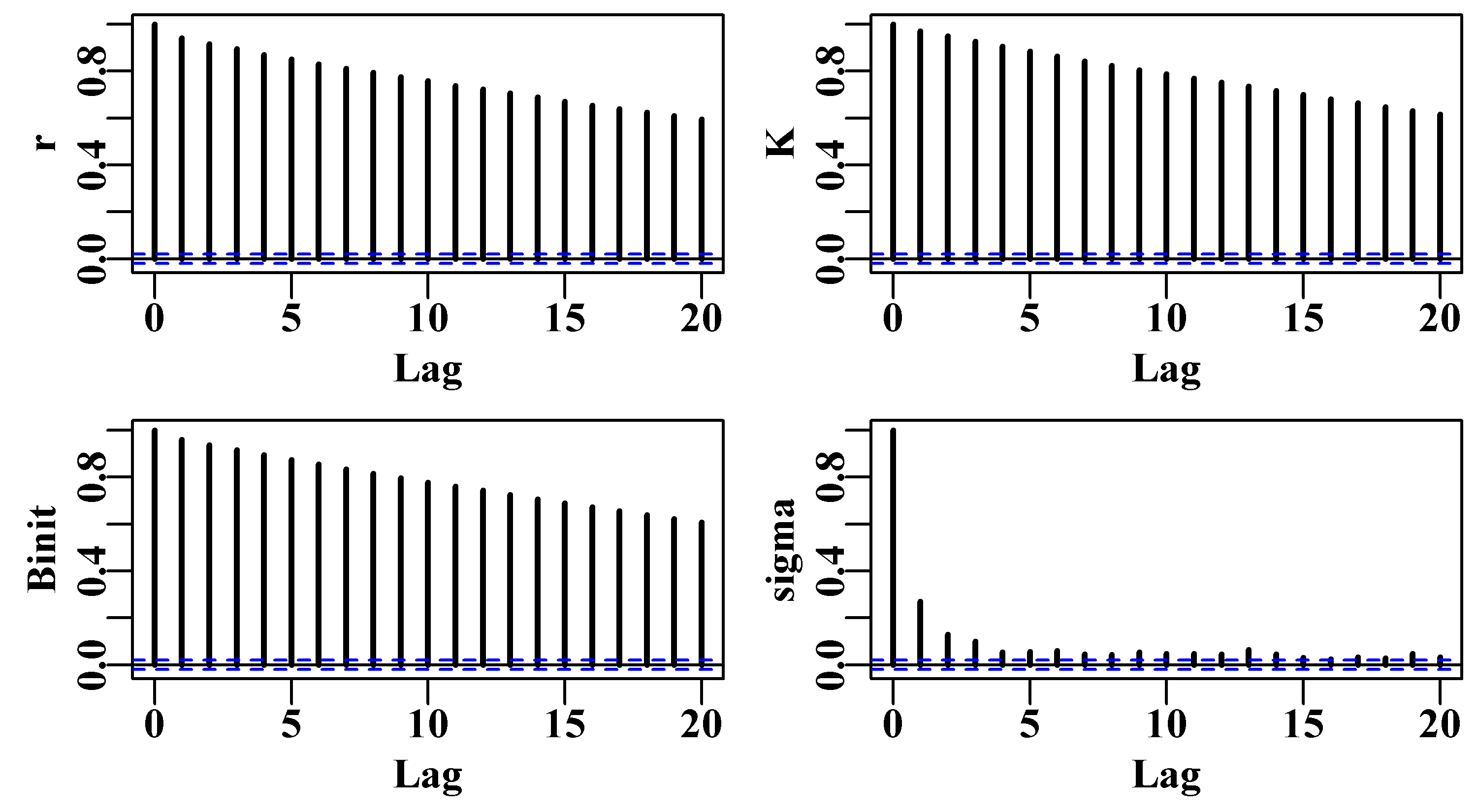
Figure 6.18: The auto-correlation exhibited in the traces for the four Schaefer model parameters. This is with a thinning step of 16 = 4 for each of four parameters. Clearly a large increase in needed to remove the strong correlations that occur.
If we run an MCMC with a much larger thinning rate, hopefully we will be able to see the reduction in serial correlation. Here we increase the thinning rate 128 times (4x4=16 to 4x128=512) and plot the outcome. Even though we have reduced the length of the chain to 1000, the total number of steps is (512 x 1000) + (512 x 100) = 563200, so we can expect this to take a little longer than the initial MCMC run. It is always a good idea to have some idea about how long a run will take. These examples all run in at most a few minutes, most MCMC runs for serious models take many hours and sometimes days.
 #setup MCMC with thinstep of 128 per parameter  Fig 6.19
begin=gettime()
scales <- c(0.06,0.05,0.06,0.4)
inpar <- log(c(r= 0.4,K=9400,Binit=3400,sigma=0.05))
result <- do_MCMC(chains=1,burnin=100,N=1000,thinstep=512,inpar,
                  negLL,calcpred=simpspm,calcdat=fish,
                  obsdat=logce,calcprior,scales,schaefer=TRUE)
posterior <- result[[1]][[1]]
label <- colnames(posterior)[1:4]
parset(plots=c(2,2),cex=0.85)
for (i in 1:4) auto <- acf(posterior[,i],type="correlation",lwd=2,
plot=TRUE,ylab=label[i],lag.max=20) 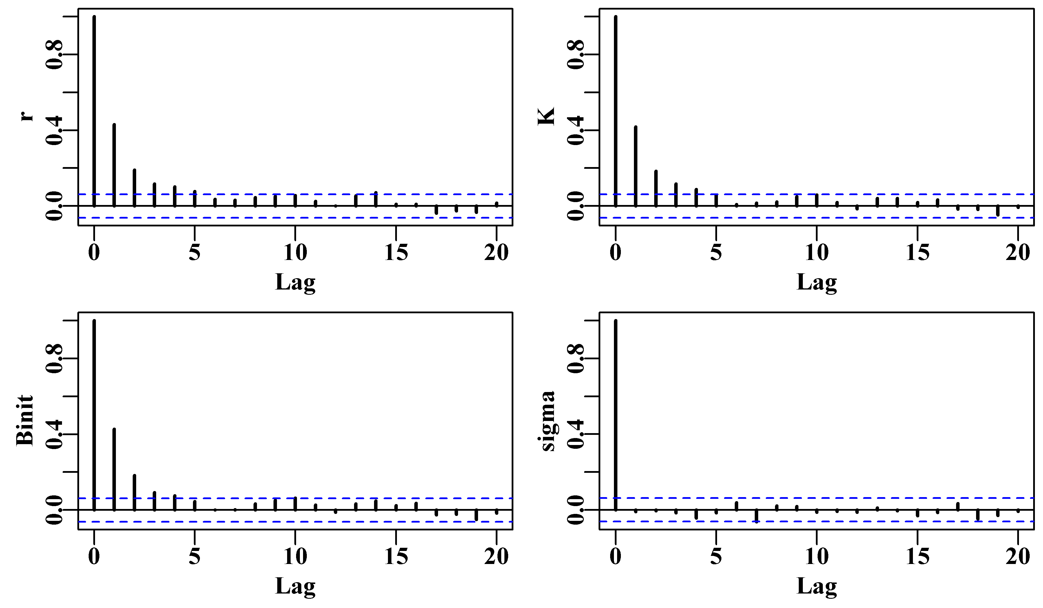
Figure 6.19: The auto-correlation exhibited in the traces for the four Schaefer model parameters when the thinning step is 512 = 4 x 128, which is 128 times that used in the first auto-correlation diagram.
# 44.31633There is clearly a marked reduction in the auto-correlation exhibited in the four parameter traces when the thinning step is increased from 4 to 128 (4 * 128 = 512), Figure(6.19). But even that 32x increase is not sufficient to reduce the correlations within lags of 2, 3 and 4 to insignificance. Despite that an examination of the traces generated with that thinning step clearly shows a difference (improvement) relative to the traces in Figure(6.17). However, we note that the 563200 steps (1100 length chain) took about 40 seconds, on the desktop computer I am using, which is starting to get a little slow for interactive work. Had we used 10000 iterations at a thinning rate of 512 that would take nearly 7 minutes, which is beginning to get tediously long. More complex models might be another order of magnitude or more in duration, sometimes days! Thus, before we explore the effectiveness of even larger thinning steps, we will first find ways to speed each cycle significantly. Through continued trials it was found that doubling thinstep to 1024 (4 x 256) still had significant auto-correlation at lags of 1 and sometimes 2, and it took a four-fold increase to a thinstep = 2048 (4 * 3 * 128) to remove the auto-correlation from all variables.
Before looking for speedier ways of doing things, we will finish the examination of the standard illustrative plots that one might use when conducting an MCMC examination of the uncertainty or variation within a modelling framework.
6.7.9 Marginal Distributions
One approach to visualizing the posterior distribution is to examine the frequency distribution of the accepted values of each parameter. Plotting the outline from the density() function on top of the histogram can also improve our view of the distribution found by the MCMC. In the case below it appears that 1000 replicates is not sufficient to smooth each distribution, even with a thinning rate per parameter of 128. However, determining how many replicates are sufficient is really asking whether the posterior has converged on the stationary distribution. Rather than going by intuition and the appearance of various plots it is better to use various standard diagnostics. Most of the figures plotted relating to MCMC outputs using a thinning rate of 16 appear to suggest plausibly smooth solutions. Nevertheless, the auto-correlation is so large the outputs could be biased. It is always better to use quantifiable diagnostics.
 # plot marginal distributions from the MCMC  Fig 6.20
dohist <- function(x,xlab) { # to save a little space
  return(hist(x,main="",breaks=50,col=0,xlab=xlab,ylab="",
               panel.first=grid()))
}
 # ensure we have the optimum solution available
param <- log(c(r= 0.42,K=9400,Binit=3400,sigma=0.05))
bestmod <- nlm(f=negLL,p=param,funk=simpspm,indat=abdat,
               logobs=log(abdat$cpue))
optval <- exp(bestmod$estimate)
posterior <- result[[1]][[1]] #example above N=1000, thin=512
par(mfrow=c(5,1),mai=c(0.4,0.3,0.025,0.05),oma=c(0,1,0,0))
par(cex=0.85, mgp=c(1.35,0.35,0), font.axis=7,font=7,font.lab=7)
np <- length(param)
for (i in 1:np) { #store invisible output from hist for later use
  outH <- dohist(posterior[,i],xlab=colnames(posterior)[i])
  abline(v=optval[i],lwd=3,col=4)
  tmp <- density(posterior[,i])
  scaler <- sum(outH$counts)*(outH$mids[2]-outH$mids[1])
  tmp$y <- tmp$y * scaler
  lines(tmp,lwd=2,col=2)
}
msy <- posterior[,"r"]*posterior[,"K"]/4
mout <- dohist(msy,xlab="MSY")
tmp <- density(msy)
tmp$y <- tmp$y * (sum(mout$counts)*(mout$mids[2]-mout$mids[1]))
lines(tmp,lwd=2,col=2)
abline(v=(optval[1]*optval[2]/4),lwd=3,col=4)
mtext("Frequency",side=2,outer=T,line=0.0,font=7,cex=1.0) 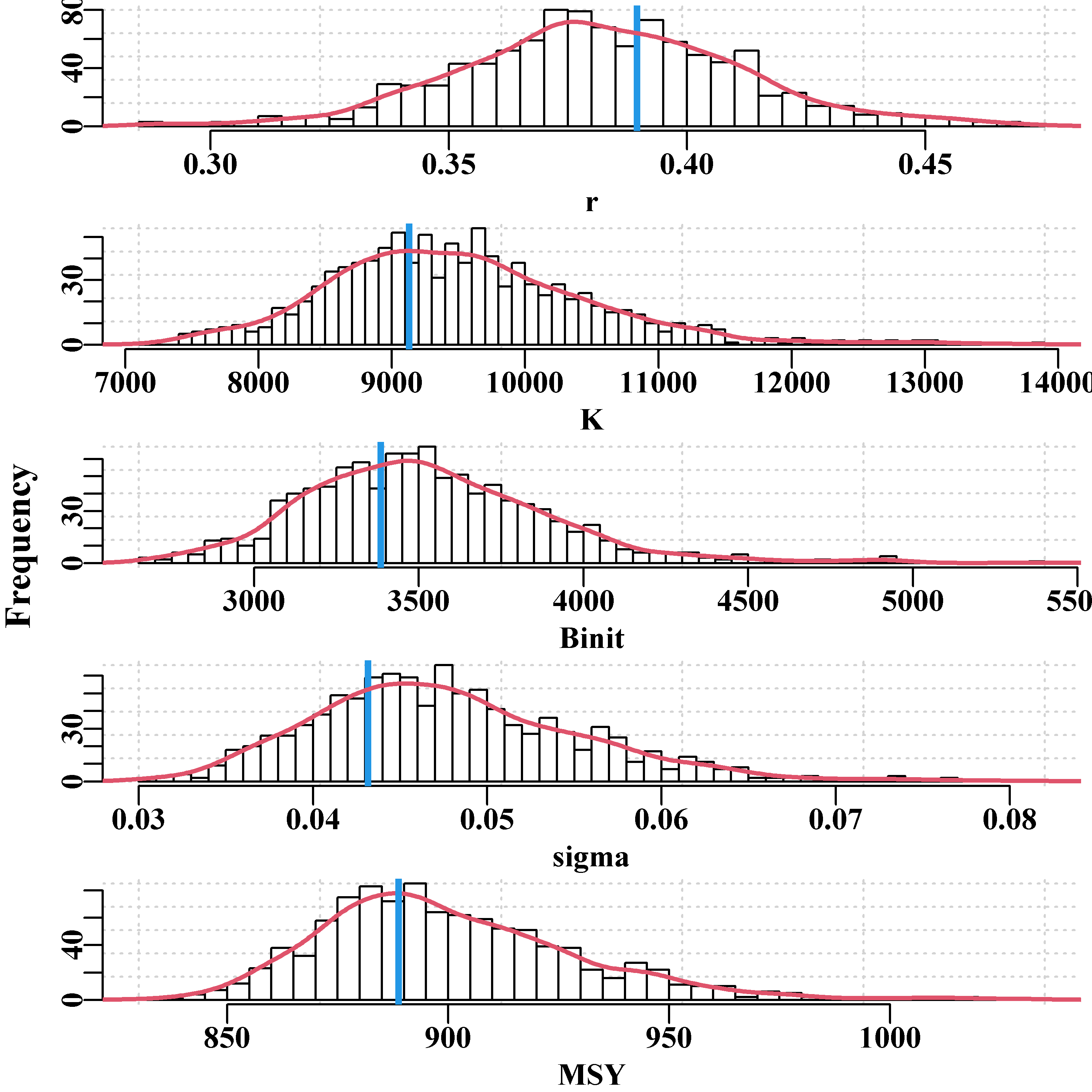
Figure 6.20: The marginal posterior distributions for the 1000 points at a thinning rate of 128. The vertical blue line, in each case, is the maximum likelihood optimum estimate. More replicates may be needed to smooth the distributions. The posterior mode is not necessarily the same as the maximum likelihood estimate.
We could try to run multiple, independent chains and then determine whether they generate the same results (perhaps the mean, variance, and distribution shape). However, to ensure a stable posterior distribution, if we use a large thinning rate then it is likely that we will need a large number of iterations in each chain. Before we explore those options we will examine how we might speed up the MCMC process.
6.8 The Use of Rcpp
With simple models such as the examples we have used so far in this chapter, the time taken to run even 200,000 replicates (a thinning step length of 8 means this would involve 1.6 million likelihood calculations) is not overly onerous. However, with more complex models, or when trying to remove high levels of serial or auto-correlation, the time involved when running an MCMC can become tiresome. If you have a procedure that takes what feels like a long time to run then it will likely be worthwhile to profile that part of your code. This is easily done within R by using the Rprof() function. Once initiated, this function interrupts execution every now and then (defaults to 0.02 of a second) and determines what function is running at the moment of interruption. These occurrences are all logged and once the software has completed running one can apply the function summaryRprof() to discover which functions are active for the most time (self.time). One can then attempt to speed up those slow parts. The total.time includes the time spent in a function and any functions that it calls.
 #profile the running of do_MCMC  using the now well known abdat
data(abdat); logce <- log(abdat$cpue); fish <- as.matrix(abdat)
param <- log(c(r=0.39,K=9200,Binit=3400,sigma=0.05))
Rprof(append=TRUE)  # note the use of negLL1()
result <- do_MCMC(chains=1,burnin=100,N=20000,thinstep=16,inpar=param,
                 infunk=negLL1,calcpred=simpspm,calcdat=fish,
                 obsdat=logce,priorcalc=calcprior,
                 scales=c(0.07,0.06,0.07,0.45))
Rprof(NULL)
outprof <- summaryRprof() | self.time | self.pct | total.time | total.pct | |
|---|---|---|---|---|
| “funk” | 44.80 | 50.93 | 58.58 | 66.60 |
| “infunk” | 17.38 | 19.76 | 80.32 | 91.31 |
| “mean” | 5.56 | 6.32 | 7.16 | 8.14 |
| “do_MCMC” | 4.76 | 5.41 | 86.84 | 98.73 |
| “max” | 3.80 | 4.32 | 3.80 | 4.32 |
| “which” | 2.50 | 2.84 | 3.48 | 3.96 |
| “dnorm” | 2.08 | 2.36 | 2.08 | 2.36 |
| “mean.default” | 1.18 | 1.34 | 1.60 | 1.82 |
| “eval” | 1.04 | 1.18 | 87.88 | 99.91 |
| “priorcalc” | 1.04 | 1.18 | 1.20 | 1.36 |
| “penalty0” | 0.92 | 1.05 | 0.92 | 1.05 |
| “isTRUE” | 0.82 | 0.93 | 1.14 | 1.30 |
Obviously, virtually all the time (total.time) is spent within the do_MCMC() function but within that it spends about 80% of the time inside funk() = calcpred() = simpspm(). A reasonable amount of time is also spent in the functions mean(), and so on down the list. Both [.data.frame and [ relate to indexing of results being placed into the matrix posterior within the do_MCMC() function. if they occur in your Rprof list you can partly improve that slow-down by converting the data.frame of input data into a matrix. You should compare the speed of computation using each form of data. The R software is truly excellent but, even with the increases in speed in recent versions and with modern computers, nobody would claim it was rapid with regard to computer-intensive methods such as MCMC. It seems clear that if we could speed up the simpspm() function (i.e. funk) we might be able to obtain some significant speed gains when running an MCMC. Perhaps the best way would be to use Stan (see https://mc-stan.org/) but in the interests of keeping as much as possible within base R, we will examine an alternative.
One extremely useful approach to increasing the speed of execution is to combine the R-code with another computer language which can be compiled into executable code rather than the interpreted code of R. Perhaps the simplest method for including C++ code into one’s R-code is to use the Rcpp package (Eddelbuettel & Francois, 2011; Eddelbuettel, 2013; Eddelbuettel & Balmuta, 2017). Obviously to use this one needs both a C++ compiler and the Rcpp package, both of which can be downloaded from the CRAN repository (most easily done within RStudio). If the reader is working on a Linux or Mac computer then they already have the GNU C++ compiler (used by Rcpp). On Windows the easiest way to install the GNU C++ compiler is to go to the CRAN home page, click on the Download R for Windows link, and then the Rtools link. Be sure to include the installation directory into your path. This also provides many tools useful for writing R packages. Rcpp provides a number of approaches for including C++ code with perhaps the simplest way being to use the cppFunction() to compile code at the start of each session. However, an even better way is to use the function Rcpp::sourceCpp() to load a C++ file from disk in the same way you might use source() to load a file of R code. So there are options, which are well worth exploring if you are going to pursue this strategy of speeding up your code.
6.8.1 Addressing Vectors and Matrices
In the following code block you can see that the cppFunction() requires the C++ code to be input as one long text string. One complication with using C++ is that in R, vectors, matrices, and arrays run from 1:N,… whereas in C++ an equivalent number of cells would run from 0:(N-1),…. The power of habit can make fools of us when we switch back and forth between R and C++ (or perhaps that is just me). For example, when developing the C++ code below I initially set biom[0] = ep[3]. So, I remembered to use 0 instead of 1 in the biom[0] part but promptly forgot the indexing issue again by setting the initial biomass level in the time-series of biomass to the value of sigma in the parameter vector rather than Binit. In R the pars variable contains \(r\) in index 1, \(K\) in index 2, \(B_{init}\) in 3, and \(sigma\) in 4, but in C++ the indices are 0, 1, 2, and 3. If these last few sentences are confusing to you then consider that to be a good thing because hopefully, if you go down this route of speeding your code, you will remember to be very careful over indexing variables within vectors and matrices. As you will quite possibly discover, if you use an index which points outside of an array in C++ (index 4 in a vector of 0, 1, 2, and 3, does not exist but does point to somewhere in memory!), this generally leads to R bombing out and the need for a restart. One quickly learns to save everything before running anything when developing C++ code within R, I recommend that you do the same.
Of course, programming in C++ and the use of Rcpp both have their complications, but reviewing these subjects is not the intent of this chapter or book. Nevertheless, hopefully this simple example will illustrate the rather remarkable advantages of using such methods when applying computer-intensive methods and succeeds in encouraging you to learn and use such methods in the right circumstances. Eddelbuettel (2013) and Wickham (2019) provide excellent introductions to the advantages of Rcpp.
6.8.2 Replacement for simpspm()
The code in the following chunk would need to be run before running any code that wanted to use the simpspmC() function instead of simpspm(), or one could place it in a separate R file and source it into your own code.
library(Rcpp)
 #Send a text string containing the C++ code to cppFunction this will
 #take a few seconds to compile, then the function simpspmC will
 #continue to be available during the rest of your R session. The
 #code in this chunk could be included into its own R file, and then
 #the R source() function can be used to include the C++ into a
 #session. indat must have catch in col2 (col1 in C++), and cpue in
 #col3 (col2 in C++). Note the use of ; at the end of each line.
 #Like simpspm(), this returns only the log(predicted cpue).
cppFunction('NumericVector simpspmC(NumericVector pars,
             NumericMatrix indat, LogicalVector schaefer) {
    int nyrs = indat.nrow();
    NumericVector predce(nyrs);
    NumericVector biom(nyrs+1);
    double Bt, qval;
    double sumq = 0.0;
    double p = 0.00000001;
    if (schaefer(0) == TRUE) {
      p = 1.0;
    }
    NumericVector ep = exp(pars);
    biom[0] = ep[2];
    for (int i = 0; i < nyrs; i++) {
      Bt = biom[i];
      biom[(i+1)]=Bt+(ep[0]/p)*Bt*(1-pow((Bt/ep[1]),p))-
                      indat(i,1);
      if (biom[(i+1)] < 40.0) biom[(i+1)] = 40.0;
      sumq += log(indat(i,2)/biom[i]);
    }
    qval = exp(sumq/nyrs);
    for (int i = 0; i < nyrs; i++) {
      predce[i] = log(biom[i] * qval);
    }
    return predce;
}')
Once the cppFunction() code has been run then we can use the simpspmC() function anywhere the simpspm() function was used. One small complication is that simpspmC() expects the input data, abdat, to be a matrix, whereas abdat starts as a data.frame (which is actually a list, try class(abdat)). Inputting a data.frame instead of a matrix would cause the C++ function to fail, so, to fix this, in the code below, you will see that we have used the function as.matrix() to ensure the correct class of object is sent to simpspmC(), fortunately, a matrix is faster to use than a data.frame so we give that to simpspm() as well. We have also included the package microbenchmark so as to enable accurate comparisons of the speed of operation of the two different functions. Obviously this would need to be installed for it to be used (it can be omitted if you do not wish to install it). In the comparisons, on my Windows 10, 2018 XPS 13, simpspmC() typically took only a 20th the time taken by simpspm(), Table(6.8), going by the median times. The first use of the simpspmC() function sometimes has some very slow starts, which can influence the mean but the medians are less disturbed.
 #Ensure results obtained from simpspm and simpspmC are same
library(microbenchmark)
data(abdat)
fishC <- as.matrix(abdat) # Use a matrix rather than a data.frame
inpar <- log(c(r= 0.389,K=9200,Binit=3300,sigma=0.05))
spmR <- exp(simpspm(inpar,fishC)) # demonstrate equivalence
 #need to declare all arguments in simpspmC, no default values
spmC <- exp(simpspmC(inpar,fishC,schaefer=TRUE))
out <- microbenchmark( # verything identical calling function
  simpspm(inpar,fishC,schaefer=TRUE),
  simpspmC(inpar,fishC,schaefer=TRUE),
  times=1000
)
out2 <- summary(out)[,2:8]
out2 <- rbind(out2,out2[2,]/out2[1,])
rownames(out2) <- c("simpspm","simpspmC","TimeRatio") | spmR | spmC | spmR | spmC | spmR | spmC | |
|---|---|---|---|---|---|---|
| 1 | 1.1251 | 1.1251 | 1.4538 | 1.4538 | 2.1314 | 2.1314 |
| 2 | 1.0580 | 1.0580 | 1.5703 | 1.5703 | 2.0773 | 2.0773 |
| 3 | 1.0774 | 1.0774 | 1.7056 | 1.7056 | 2.0396 | 2.0396 |
| 4 | 1.0570 | 1.0570 | 1.8446 | 1.8446 | 1.9915 | 1.9915 |
| 5 | 1.0827 | 1.0827 | 1.9956 | 1.9956 | 1.9552 | 1.9552 |
| 6 | 1.1587 | 1.1587 | 2.0547 | 2.0547 | 1.9208 | 1.9208 |
| 7 | 1.2616 | 1.2616 | 2.1619 | 2.1619 | 1.8852 | 1.8852 |
| 8 | 1.3616 | 1.3616 | 2.2037 | 2.2037 | 1.8276 | 1.8276 |
We can now tabulate the output from the microbenchmarking
| min | lq | mean | median | uq | max | neval | |
|---|---|---|---|---|---|---|---|
| simpspm | 58.001 | 62.501 | 67.895 | 64.551 | 66.601 | 2458.001 | 1000 |
| simpspmC | 3.001 | 3.401 | 5.336 | 4.101 | 4.401 | 899.901 | 1000 |
| TimeRatio | 0.052 | 0.054 | 0.079 | 0.064 | 0.066 | 0.366 | 1 |
The maximum for the simpspmC will sometimes be larger than for the simpspm, which is because the first time it is called sometimes takes longer. If this happens to you then try running the comparison again and notice the change in the maximum. The real comparison of interest, however, is how much quicker on average it is to run an MCMC using simpspmC() rather than simpspm(). We can do this without using microbenchmark as the time taken is now appreciable for each run. Instead we use the MQMF function gettime(), which provides time as seconds since the start of each day.
 #How much does using simpspmC in do_MCMC speed the run time?
 #Assumes Rcpp code has run, eg source("Rcpp_functions.R")
set.seed(167423) #Can use getseed() to generate a suitable seed
beginR <- gettime()  #to enable estimate of time taken
setscale <- c(0.07,0.06,0.07,0.45)
reps <- 2000  #Not enough but sufficient for demonstration
param <- log(c(r=0.39,K=9200,Binit=3400,sigma=0.05))
resultR <- do_MCMC(chains=1,burnin=100,N=reps,thinstep=128,
                  inpar=param,infunk=negLL1,calcpred=simpspm,
                  calcdat=fishC,obsdat=log(abdat$cpue),schaefer=TRUE,
                  priorcalc=calcprior,scales=setscale)
timeR <- gettime() - beginR
cat("time = ",timeR,"\n")
cat("acceptance rate = ",resultR$arate," \n")
postR <- resultR[[1]][[1]]
set.seed(167423)     # Use the same pseudo-random numbers and the
beginC <- gettime()  # same starting point to make the comparsion
param <- log(c(r=0.39,K=9200,Binit=3400,sigma=0.05))
resultC <- do_MCMC(chains=1,burnin=100,N=reps,thinstep=128,
                 inpar=param,infunk=negLL1,calcpred=simpspmC,
                 calcdat=fishC,obsdat=log(abdat$cpue),schaefer=TRUE,
                 priorcalc=calcprior,scales=setscale)
timeC <- gettime() - beginC
cat("time = ",timeC,"\n")  # note the same acceptance rates
cat("acceptance rate = ",resultC$arate," \n")
postC <- resultC[[1]][[1]]
cat("Time Ratio = ",timeC/timeR)
# time = 21.91359
# acceptance rate = 0.319021 0.3187083 0.3282664 0.368747
# time = 4.474519
# acceptance rate = 0.319021 0.3187083 0.3282664 0.368747
# Time Ratio = 0.2041893While the exact times taken will vary in each run, because of other processes your computer will be running, generally the use of simpspmC() takes only 1/5 or 20% of the time that using simpspm() takes. When dealing with minutes this may not seem that important, but once an MCMC run take 20 - 40 hours then a saving of 16 - 32 hours might be seen as more valuable. Of course there are potentially other ways to speed the process and this is generally worthwhile for the truly computer-intensive analyses.
The outcomes obtained from using either of the two functions are equivalent to running different chains, although only if the set.seed() function uses different values, or, better, is not used at all. If you used the same seed then the resulting marginal distribution would be identical. With different seeds, but with only 2000 iterations, some deviations might be expected. Now that we have a faster method we can explore larger numbers of iterations while keeping larger thinning rates at the same time.
 #compare marginal distributions of the 2 chains  Fig 6.21
par(mfrow=c(1,1),mai=c(0.45,0.45,0.05,0.05),oma=c(0.0,0,0.0,0.0))
par(cex=0.85, mgp=c(1.35,0.35,0), font.axis=7,font=7,font.lab=7)
maxy <- getmax(c(density(postR[,"K"])$y,density(postC[,"K"])$y))
plot(density(postR[,"K"]),lwd=2,col=1,xlab="K",ylab="Density",
     main="",ylim=c(0,maxy),panel.first=grid())
lines(density(postC[,"K"]),lwd=3,col=5,lty=2) 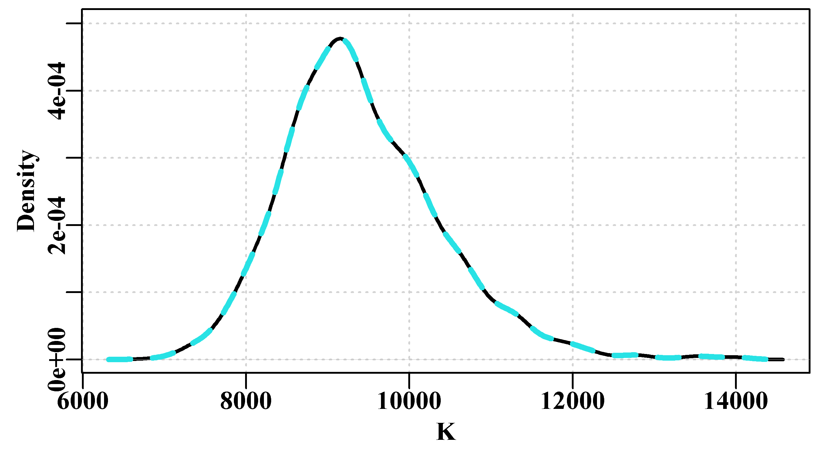
Figure 6.21: A comparison of the K parameter density distribution for the chains produced by the simpspm function (solid black line) and the simpspmC function (dashed blue line), with each chain having identical starting positions and the same random seed they lie on top of each other. Repeat these examples with different seeds, and or different starting positions to see the effect.
6.8.3 Multiple Independent Chains
Best practice when conducting an MCMC analysis is to run multiple chains, but in practice the total number of chains generated tends to be a trade-off between the time available and having at least three or more chains. What is important is to provide sufficient evidence to support the analyst’s claim about the analysis having reached convergence. Here we will use just three chains, although in reality, for such a simple model, running more would be more convincing. For better speed we will now only use simpspmC() because each chain before thinning will be 10100 x 256 = 2585600 long (2585600 x 3 = 7756800, 7.7 million iterations).
 #run multiple = 3 chains
setscale <- c(0.07,0.06,0.07,0.45)  # I only use a seed for
set.seed(9393074) # reproducibility within this book
reps <- 10000   # reset the timer
beginC <- gettime()  # remember a thinstep=256 is insufficient
resultC <- do_MCMC(chains=3,burnin=100,N=reps,thinstep=256,
                   inpar=param,infunk=negLL1,calcpred=simpspmC,
                   calcdat=fishC,obsdat=log(fishC[,"cpue"]),
                   priorcalc=calcprior,scales=setscale,schaefer=TRUE)
cat("time = ",gettime() - beginC," secs  \n")
# time = 133.4297 secs #3 chain run using simpspmC, 10000 reps, thinstep=256 Fig 6.22
par(mfrow=c(2,2),mai=c(0.4,0.45,0.05,0.05),oma=c(0.0,0,0.0,0.0))
par(cex=0.85, mgp=c(1.35,0.35,0), font.axis=7,font=7,font.lab=7)
label <- c("r","K","Binit","sigma")
for (i in 1:4) {
plot(density(resultC$result[[2]][,i]),lwd=2,col=1,
xlab=label[i],ylab="Density",main="",panel.first=grid())
lines(density(resultC$result[[1]][,i]),lwd=2,col=2)
lines(density(resultC$result[[3]][,i]),lwd=2,col=3)
} 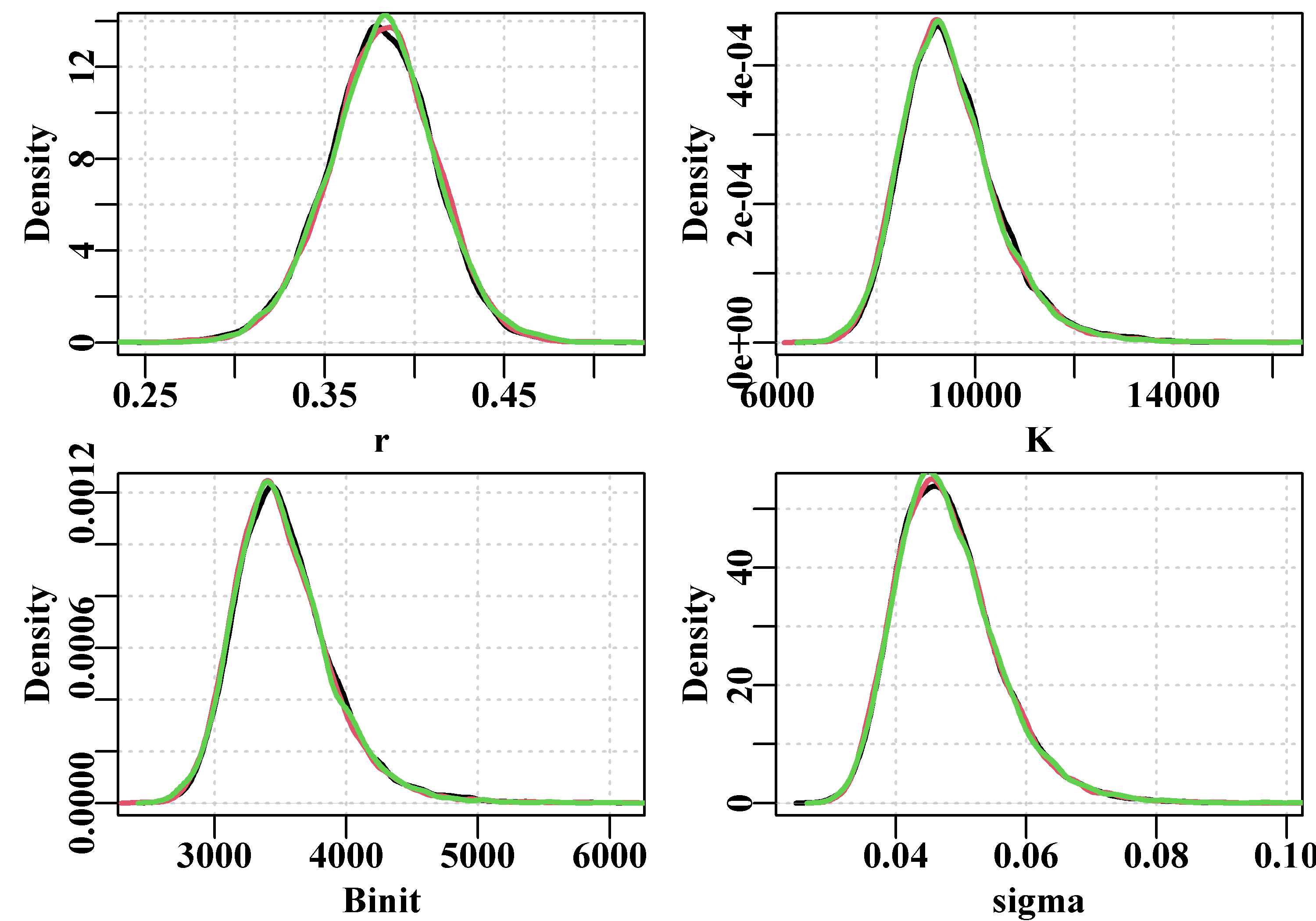
Figure 6.22: The variation between three chains in the marginal density distributions for the four Schaefer parameters using 10000 replicates at a thinning rate of 64 (4x64=256), and the simpspmC function. Slight differences are apparent where the line is wider than average.
We can also generate summary statistics for the different chains. Indeed, there are many different diagnostic statistics and plots that can be used.
 #generate summary stats from the 3 MCMC chains
av <- matrix(0,nrow=3,ncol=4,dimnames=list(1:3,label))
sig2 <- av  # do the variance
relsig <- av # relative to mean of all chains
for (i in 1:3) {
  tmp <- resultC$result[[i]]
  av[i,] <- apply(tmp[,1:4],2,mean)
  sig2[i,] <- apply(tmp[,1:4],2,var)
}
cat("Average \n")
av
cat("\nVariance per chain \n")
sig2
cat("\n")
for (i in 1:4) relsig[,i] <- sig2[,i]/mean(sig2[,i])
cat("Variance Relative to Mean Variance of Chains \n")
relsig
# Average
# r K Binit sigma
# 1 0.3821707 9495.580 3522.163 0.04805695
# 2 0.3809524 9530.307 3537.186 0.04811021
# 3 0.3822318 9487.911 3522.021 0.04810015
#
# Variance per chain
# r K Binit sigma
# 1 0.0009018616 1060498.2 151208.8 6.264484e-05
# 2 0.0008855405 998083.0 142153.1 6.177037e-05
# 3 0.0009080043 978855.6 138585.3 6.288734e-05
#
# Variance Relative to Mean Variance of Chains
# r K Binit sigma
# 1 1.0037762 1.0474275 1.0501896 1.0033741
# 2 0.9856108 0.9857815 0.9872949 0.9893677
# 3 1.0106130 0.9667911 0.9625155 1.0072582If we compare the quantile of the different distributions we can obtain a clearer idea of the scale of any differences. The percent differences are where we directly compare the values in the 2.5% and 97.5% quantiles (the central 95% of the distribution) and the medians of the second and third marginal distributions, and only one comparison (the upper 97.5% point of Binit) is larger than 1%.
 #compare quantile from the 2 most widely separate MCMC chains
tmp <- resultC$result[[2]] # the 10000 values of each parameter
cat("Chain 2 \n")
msy1 <- tmp[,"r"]*tmp[,"K"]/4
ch1 <- apply(cbind(tmp[,1:4],msy1),2,quants)
round(ch1,4)
tmp <- resultC$result[[3]]
cat("Chain 3 \n")
msy2 <- tmp[,"r"]*tmp[,"K"]/4
ch2 <-  apply(cbind(tmp[,1:4],msy2),2,quants)
round(ch2,4)
cat("Percent difference ")
cat("\n2.5%  ",round(100*(ch1[1,] - ch2[1,])/ch1[1,],4),"\n")
cat("50%   ",round(100*(ch1[3,] - ch2[3,])/ch1[3,],4),"\n")
cat("97.5% ",round(100*(ch1[5,] - ch2[5,])/ch1[5,],4),"\n")
# Chain 2
# r K Binit sigma msy1
# 2.5% 0.3206 7926.328 2942.254 0.0356 853.1769
# 5% 0.3317 8140.361 3016.340 0.0371 859.6908
# 50% 0.3812 9401.467 3489.550 0.0472 896.5765
# 95% 0.4287 11338.736 4214.664 0.0624 955.1773
# 97.5% 0.4386 11864.430 4425.248 0.0662 970.7137
# Chain 3
# r K Binit sigma msy2
# 2.5% 0.3225 7855.611 2920.531 0.0355 853.0855
# 5% 0.3324 8090.493 3001.489 0.0371 859.3665
# 50% 0.3826 9370.715 3475.401 0.0471 895.8488
# 95% 0.4316 11248.955 4188.052 0.0626 952.1486
# 97.5% 0.4416 11750.426 4376.639 0.0665 966.2832
# Percent difference
# 2.5% -0.6006 0.8922 0.7383 0.4636 0.0107
# 50% -0.3871 0.3271 0.4055 0.2278 0.0812
# 97.5% -0.6817 0.9609 1.0985 -0.5278 0.45646.8.4 Replicates Required to Avoid Serial Correlation
We saw earlier that if the thinning rate is too low there can be high levels of auto-correlation within the trace or sequence of each parameter. It was clear that increasing the number of thinning steps reduces the auto-correlation. What was less clear was how large the thinning rate needed to be to make such correlations insignificant.
Now we have a faster way of exploring such a question we can search for the scale of thinning rate required. We know from our earlier trials that a thinning rate of 128 per parameter still leaves significant correlations between lags of 2 to 4 steps, so, we should examine the effect of thinning rates of 1024 (4 x 256) and 2048 (4 x 512). To make these more strictly comparable we balance the thinning rates with the iterations so we use 2000 x 1024 and 1000 * 2048 and both = 2048000. The question is whether removing the auto-correlation permits a better grasp of the full variation in the different parameters. But to make the trials comparable the un-thinned chains need to be the same length to enable the same amount of exploration of the likelihood surface. Hence, with the smaller thinning rate we need more iterations, we also need to account for the burn-in period (100 for one 50 for the other). The thinning rate of 1024 still leaves a significant correlation at a lag of 1, which disappears with the thinning level of 2028, Figure(6.23). Even with simpspmC() this routine takes about 60 seconds.
The importance of removing within-sequence correlation is that if it is high it can interfere with the convergence onto the stationary distribution (because sequential points are correlated rather than tracing the full range of the likelihood surface) and the outcome can fail to capture the full range of the variation inherent in the model and available data being investigated.
 #compare two higher thinning rates per parameter in MCMC
param <- log(c(r=0.39,K=9200,Binit=3400,sigma=0.05))
setscale <- c(0.07,0.06,0.07,0.45)
result1 <- do_MCMC(chains=1,burnin=100,N=2000,thinstep=1024,
                   inpar=param,infunk=negLL1,calcpred=simpspmC,
                   calcdat=fishC,obsdat=log(abdat$cpue),
                   priorcalc=calcprior,scales=setscale,schaefer=TRUE)
result2 <- do_MCMC(chains=1,burnin=50,N=1000,thinstep=2048,
                   inpar=param,infunk=negLL1,calcpred=simpspmC,
                   calcdat=fishC,obsdat=log(abdat$cpue),
                   priorcalc=calcprior,scales=setscale,schaefer=TRUE)
#autocorrelation of 2 different thinning rate chains Fig6.23
posterior1 <- result1$result[[1]]
posterior2 <- result2$result[[1]]
label <- colnames(posterior1)[1:4]
par(mfrow=c(4,2),mai=c(0.25,0.45,0.05,0.05),oma=c(1.0,0,1.0,0.0))
par(cex=0.85, mgp=c(1.35,0.35,0), font.axis=7,font=7,font.lab=7)
for (i in 1:4) {
auto <- acf(posterior1[,i],type="correlation",plot=TRUE,
ylab=label[i],lag.max=20,xlab="",ylim=c(0,0.3),lwd=2)
if (i == 1) mtext(1024,side=3,line=-0.1,outer=FALSE,cex=1.2)
auto <- acf(posterior2[,i],type="correlation",plot=TRUE,
ylab=label[i],lag.max=20,xlab="",ylim=c(0,0.3),lwd=2)
if (i == 1) mtext(2048,side=3,line=-0.1,outer=FALSE,cex=1.2)
}
mtext("Lag",side=1,line=-0.1,outer=TRUE,cex=1.2) 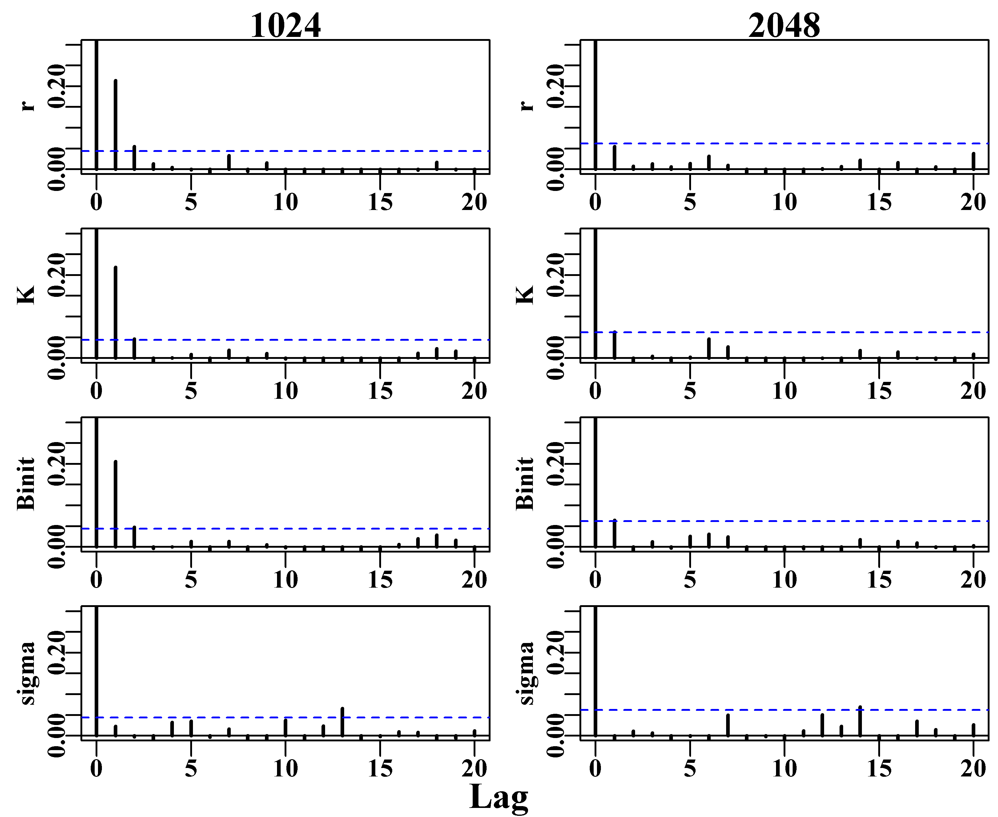
Figure 6.23: The auto-correlation of two chains across the four parameters of the Schaefer model with combined thinning rates of 1024 and 2048. Note the reduced maximum on the y-axis to make the differences between the two more apparent.
We can compare the two chains with different thinning rates in the same way that we compared the three replicate chains above. That is, we can plot their marginal distributions and compare their quantile distributions. Given the limited number of final replicates after thinning the marginal distributions are surprisingly similar, Figure(6.23). However, when their quantile distributions are compared, the differences observed between the central 95% of the distributions tended to be rather larger than the three chains compared in the Multiple Independent Chains section above. These differences do not appear to follow any particular direction, although the appears to be a suggestion of some bias with a shift of the lower and upper bounds in the same direction, but more replicates would be needed to clarify this.
 #visual comparison of 2 chains marginal densities  Fig 6.24
parset(plots=c(2,2),cex=0.85)
label <- c("r","K","Binit","sigma")
for (i in 1:4) {
   plot(density(result1$result[[1]][,i]),lwd=4,col=1,xlab=label[i],
        ylab="Density",main="",panel.first=grid())
   lines(density(result2$result[[1]][,i]),lwd=2,col=5,lty=2)
} 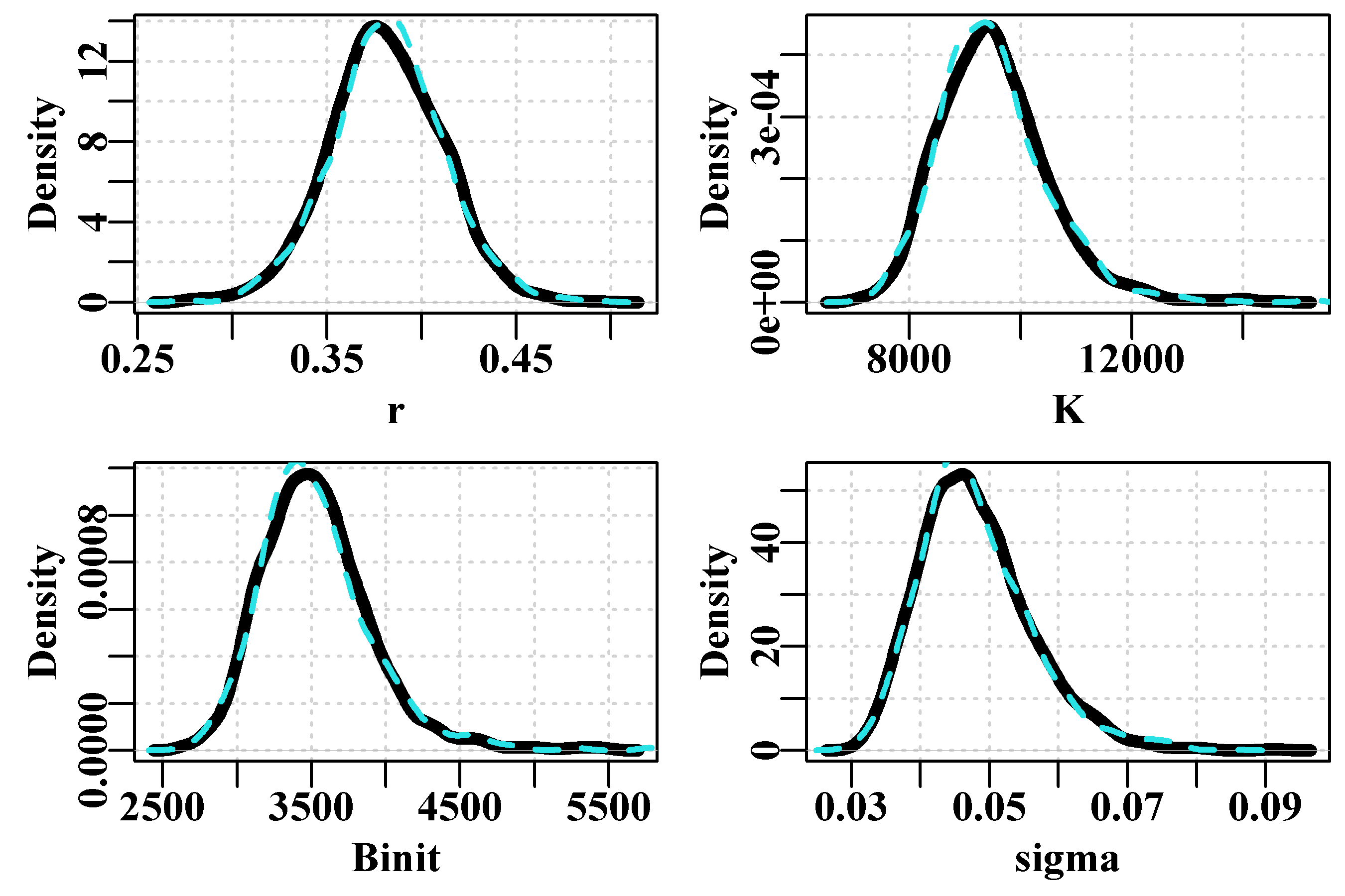
Figure 6.24: The variation between two chains in the marginal density distributions for the K parameter using 1000 and 2000 replicates at thinning rates of 2048 (dashed line) and 1024 (solid black line).
Separate MCMC chains invariably differ to some extent, which is where the notion of a criterion of similarity becomes important. In the case of these two chains there are visible differences but the actual differences were all less than 1% for the medians and in 8 out of 10 of the outer quantiles. One would geberally trust the chain with the longer thinning rate.
 #tablulate a summary of the two different thinning rates.
cat("1024 thinning rate \n")
posterior <- result1$result[[1]]
msy <-posterior[,1]*posterior[,2]/4
tmp1 <- apply(cbind(posterior[,1:4],msy),2,quants)
rge <- apply(cbind(posterior[,1:4],msy),2,range)
tmp1 <- rbind(tmp1,rge[2,] - rge[1,])
rownames(tmp1)[6] <- "Range"
print(round(tmp1,4))
posterior2 <- result2$result[[1]]
msy2 <-posterior2[,1]*posterior2[,2]/4
cat("2048 thinning rate \n")
tmp2 <- apply(cbind(posterior2[,1:4],msy2),2,quants)
rge2 <- apply(cbind(posterior2[,1:4],msy2),2,range)
tmp2 <- rbind(tmp2,rge2[2,] - rge2[1,])
rownames(tmp2)[6] <- "Range"
print(round(tmp2,4))
cat("Inner 95% ranges and Differences between total ranges \n")
cat("95% 1 ",round((tmp1[5,] - tmp1[1,]),4),"\n")
cat("95% 2 ",round((tmp2[5,] - tmp2[1,]),4),"\n")
cat("Diff  ",round((tmp2[6,] - tmp1[6,]),4),"\n")
# 1024 thinning rate
# r K Binit sigma msy
# 2.5% 0.3221 7918.242 2943.076 0.0352 853.5243
# 5% 0.3329 8139.645 3016.189 0.0367 858.8872
# 50% 0.3801 9429.118 3499.826 0.0470 895.7376
# 95% 0.4289 11235.643 4172.932 0.0627 953.9948
# 97.5% 0.4392 11807.732 4380.758 0.0663 973.2185
# Range 0.2213 7621.901 2859.858 0.0612 238.5436
# 2048 thinning rate
# r K Binit sigma msy2
# 2.5% 0.3216 7852.002 2920.198 0.0351 855.8295
# 5% 0.3329 8063.878 3000.767 0.0368 859.8039
# 50% 0.3820 9400.708 3482.155 0.0468 896.6774
# 95% 0.4313 11235.368 4184.577 0.0628 959.2919
# 97.5% 0.4434 11638.489 4456.164 0.0676 975.4358
# Range 0.2189 8156.444 3161.232 0.0546 257.1803
# Inner 95% ranges and Differences between total ranges
# 95% 1 0.1172 3889.49 1437.682 0.0311 119.6942
# 95% 2 0.1218 3786.487 1535.966 0.0325 119.6064
# Diff -0.0024 534.5429 301.3746 -0.0066 18.63676.9 Concluding Remarks
The objective of this chapter was not to encourage people to write their own bootstrap, asymptotic error, likelihood profile, or MCMC functions but to allow them to explore these methods and gain the intuitions to enable them to use them with a critical awareness of their strengths and, equally importantly, their limitations. This is especially the case when implementing an MCMC analysis where one would preferably be using something like Stan, or Template Model Builder (Kristensen et al, 2016), or AD Model Builder (Fournier et al, 1998; Fournier et al, 2012). Nevertheless, we have gone into some detail with the application of Bayesian statistics through the use of MCMC because this really is the best way of capturing all of the uncertainty inherent in any particular modelling analysis. Having said that, there are many fisheries models where numerous parameters, such as natural mortality, recruitment steepness, and some selectivity parameters, are set as constants, which, in a Bayesian context, implies extremely informative priors. That is a somewhat artificial statement because if these parameters are not estimated then we need not account for any prior probability, but in principle this is what it implies. The usual solution to such issues is to examine likelihood profiles on such parameters or conduct sensitivity analyses where the implications of using different constants are examined. It would even be possible to use a standardized likelihood profile as a prior probability.
While it is true that the use of an MCMC can provide a more complete description of the variation within a modelling scenario, such analyses fail to capture model uncertainty, where a structurally different model may provide a somewhat different view of the population dynamics being assessed. This is where discussion usually occurs over the notion of model averaging. Although that raises the issue of which model is deemed most realistic and what weight to give to each when they may be completely incommensurate. Nevertheless, model uncertainty needs to be borne in mind when examining the outcome of any modelling. As stated by Punt and Hilborn (1997) “The most common approach is to select a single structural model and to consider the uncertainty in its parameters only. A more defensible alternative is to consider a series of truly different structural models. However, apart from being computationally more intensive, it is difficult to ‘bound’ the range of models considered. A related issue is how to determine how many model parameters should be considered uncertain.”
The characterization of uncertainty is important because it provides some idea of how confident one can be when providing management advice. It is possible to get lost in the computational details and forget that the primary objective is to provide defensible management advice for some natural resource. There is no single way of doing that and so if circumstances are such that an MCMC never converges, it is still possible to apply other methods and generate a narrative about an assessment and a stock’s status through time. It obviously helps if one is aware of the methods and knows how to use and interpret what they can discover about a model and its data. In the end, however, it also helps to understand the history of a fishery and what other influences there may have been in addition to the catches removed.